Loading...
Loading...
Loading...
Loading...
Loading...
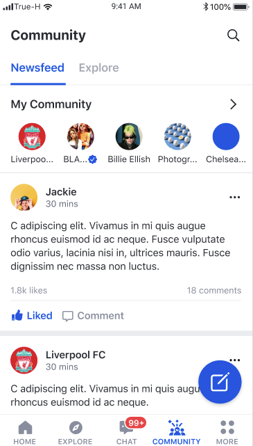
Our community group functionality within the UIKit will allow you to explore social features and how they will look in your app
Loading...
Loading...
Loading...
Loading...
Loading...
Loading...
Loading...
Loading...
Loading...
Loading...
Loading...
Loading...
Loading...
Loading...
Loading...
Loading...
Loading...
Loading...
Loading...
Loading...
Loading...
Loading...
Loading...
Loading...
Loading...
Loading...
UIKIT allows some parts of the component to be replaceable with your own component.
Loading...
UIKIT allows the default behaviour to be overridden by custom logic.
Loading...
Loading...
Loading...
Loading...
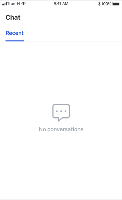
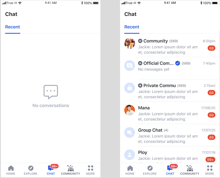
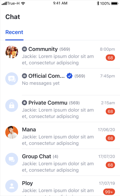
Our chat functionality within the UIKit will allow you to explore how to best integrate and design messaging features and visually see how they will look in your app
Loading...
Loading...
Loading...
Loading...
Loading...
UIKIT allows some parts of the component to be replaceable with your own component.
Loading...
Loading...
Android 5.0 (API level 21 or higher)
Java 8
androidX
Material components
Gradle 3.4.0 or higher
The UIKit API provides several strategies to integrate with your application.
Use the UIKit, ready to use out of the box
Integrate the Chat experience in the least amount of effort.
Add a custom theme to the default implementation of the UIKit.
Complete control of the visual style of Chat UI by implementing declarative styles (fonts and colours) for your user interface.
Use key components from the UIKit SDK and integrate them directly into your application.
Add the Chat UI to your existing design.
The UIKit is built on the foundation of the Amity Social Cloud API. We add a UI layer to speed product development efforts of your application. At the core, it is leveraging the same Channel, Messaging concepts, subscribing to live objects whilst adding a UIKit to accelerate product delivery and UI that delivers great user experience for companies wanting to deploy messaging and other functionality.
In the current state, there are two modules that can be used. You can follow the steps below. These two modules can be integrated into your application with ease using this documentation
Module
Description
Community (Group) Module
A feature for Social media , user can create community, create post content and see new content generate via Feed
Chat Module
A feature to allow user to create a group of chat , sending a variety of message type, such as text, image, etc.
Before using the SDK, you will need to initialise the SDK with your API key. Please find your account API key in the Amity Social Cloud Console. The ideal place to do this is on application startup, in onCreate() method of Application class.
You must first register the current device with a userId. A device registered with a userId will be permanently tied to that userId until you deliberately unregister the device, or until the device has been inactive for more than 90 days. A device registered with a specific userId will receive all messages belonging to that user.
There are many components that you can use and integrate into your existing application.
Amity modules are ready-to-use — the only things left to do for our customers are integration and frontend. Going the extra mile, we've created a UI Kit with endless customisations.
UIKit uses a default theme as part of out of the box design language.
UIKit uses the default theme as part of the design language.
The UIKit looks great without any customisations, though you can also edit the colors and fronts in the themes to suit your preferences all the same.
However, if you wish to customise the theme, you can declare changes to both colours and typography.
UIKit uses a small set of declared colours to simplify the design task for developers. These colours are automatically rendered at appropriate shades to communicate states and interaction to the users.
UIKit uses a small set of declared colours to simplify the design task for developers. These colours are automatically rendered at appropriate shades to communicate states and interaction to the users.
Customise colour themes by declaring a colour code to the specific colour key.
Customise colour theme by declare colour code to the specific colour key.
Color
Description
Default
Primary
Used for buttons and primary call to actions
#1054DE
Secondary
Used in secondary UI elements
#292B32
Alert
Used when informing users of errors or information that requires an attention.
#FA4D30
Highlight
Used for hyperlink text
#1054DE
Base
Text presented on light background
#292B32
Base Inverse
Text presented on dark background
#FFFFFF
Message Bubble
Background colour of message bubble sent by the user
#1054DE
Message Bubble Inverse
Background colour of message bubble sent to the user
#EBECEF
Feature
Description
Global feed
User can scroll vertically to see a list of posts from the global feed.
Feature
Description
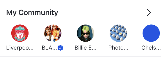
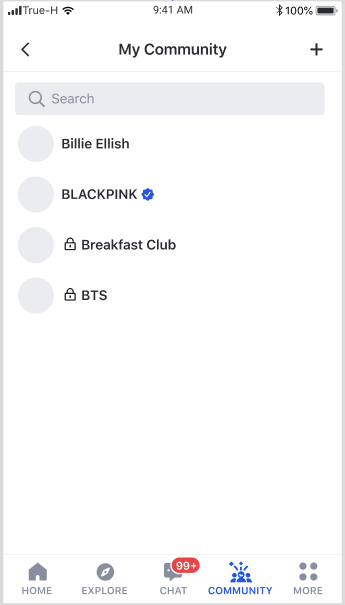
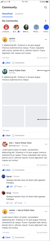
My Community list
User can scroll horizontally to see a list of up to eight communities that the user has joined sorted in alphabetical order.
Navigation to Community profile page
When a user selects an community item, the user is navigated to Community Profile page
Navigation to My community page
When a user selects the arrow, the user is navigated to My community page
Feature
Description
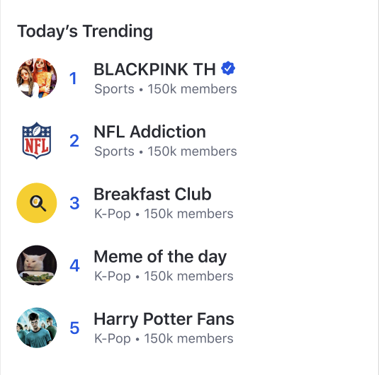
Top trending
Community list
User can see up to five top trending communities.
Navigation to Community profile
When a user selects a community item , the user is navigated to Community Profile page
Feature
Description
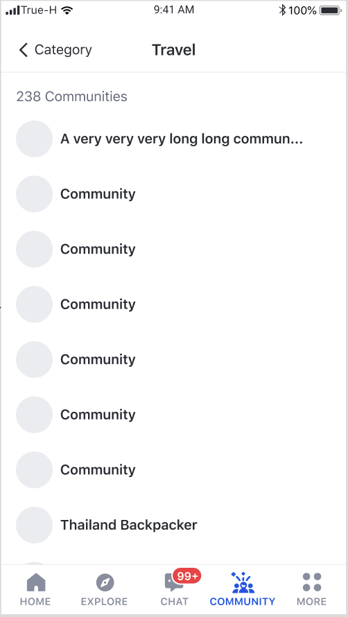
Community list by category
User can see a list of all communities that belong to a category sorted in alphabetical order.
Navigation to Community Profile page
When a user selects a community item, the user is navigated to Community Profile page
Feature | Description |
My community list | User can scroll vertically to see a list of communities that the user has joined sorted in alphabetical order. |
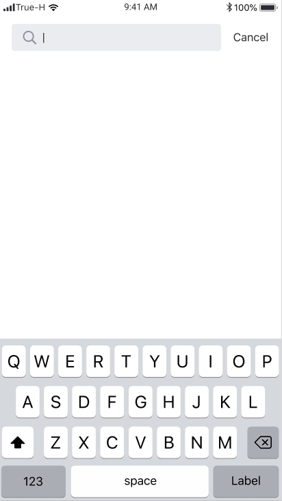
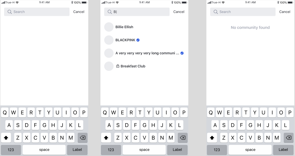
Community search | User can search for community by name |
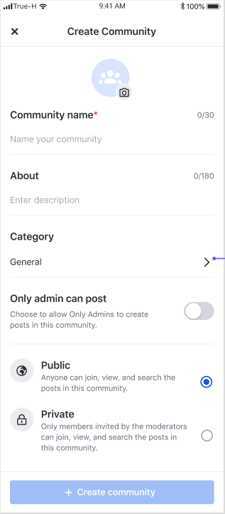
Community creation |
User can click on + button, to open
Feature | Description |
Community creation | User can create a community by filling the required fields and tapping the Create community button |
Feature
Description
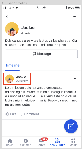
User feed
User can scroll vertically to see a list of posts from a user feed
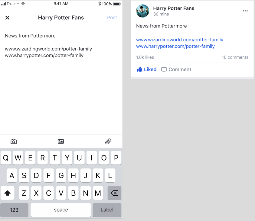
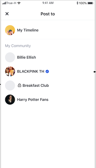
This settings allows you to control where a post can be shared to based on the post origin.
My feed - The post can be shared to my feed. This option will enable "Share to my timeline" menu when user clicks share button.
Public community - The post can be shared to any public community. This option will enable "Share to group" menu when user clicks share button.
Private community - The post can be shared to any private community. This option will enable "Share to group" menu when user clicks share button.
External - The post can be shared externally. This option will enable "More options" menu when user clicks share button.
Origin - The post can be shared within the community feed that it was created. If the post was created in either public or private community, this option will enable "Share to group" menu when user clicks share button.
My feed post - Posts that were created on my feed. By defaults, possible sharing targets are My feed, Public community, and Private community.
User feed post - Posts that were created on any other users' feed. By defaults, possible sharing targets are My feed, Public community, and Private community.
Public community feed post - Posts that were created on any public community. By defaults, possible sharing targets are My feed, Public community, and Private community.
Private community feed post - Posts that were created on any private community. By defaults, possible sharing target is Origin.
You can select a set of targets for each post origin.
Based on Post sharing settings, there are up to three post sharing events that can be emitted by UIKit.
Share to my timeline - an event emitted when a user clicks on "Share to my timeline" button.
Share to group - an event emitted when a user clicks on "Share to group" button.
Share externally - an event emitted when a user clicks "More options" button.
You can choose to intercept one or all of the events and apply your custom behaviour.
Feature
Description
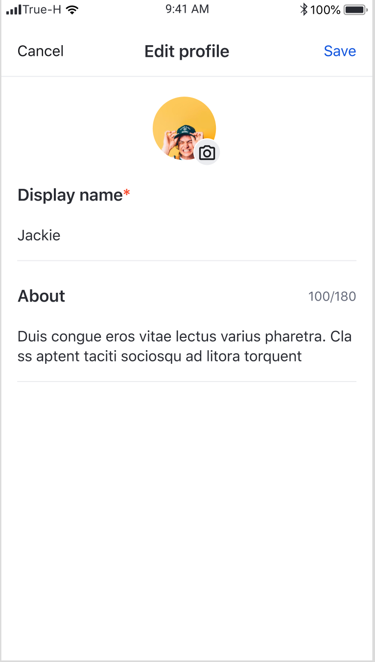
User profile update
User can update the information such as avatar, display name, and description. Profile will be updated upon tapping save button.
There are many components that you can use and integrate into your existing application.
When a user clicks on the user profile avatar at the post creator area, UIKit will open User profile page
However, you can intercept the event and define your own logic following the example below.
When you create a Fragment via a Builder, you can add your own logic via onClickUserAvatar method.
Event
Parameter
Condition
onClickUserAvatar
user: EkoUser
community avatar or community display name is tapped
onClickMessage
community: EkoCommunity
message button on community page is tapped
onClickEditProfile
community: EkoCommunity
edit profile button on community page is tapped
onClickEditUserProfile
userId: String
edit user profile button on user profile page is tapped
This page consists of one component; it is allocated in a tab.
A delegate can be passed to customise the components.
Method
Description
recentChatFragmentDelegate
Fragment delegation for EkoRecentChatFragment
Feature
Description
Recent chat list
User can see a list of the most recent chats
Navigation to Message list
When a user clicks a chat, UIKit opens a chatroom page
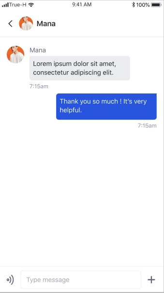
This page is a chatroom.
Use the intent to move from one activity to the EkoChatHomePageActivity as follows:
UIKit allows all types of message bubble to be replaced.
Feature
Description
User avartar
If the user has no avatar, the system will show the default avartar.
User Display name
If the user has no display name, the display name will be 'anonymous'.
Back button
Redirect user back to the previous page.
Feature
Description
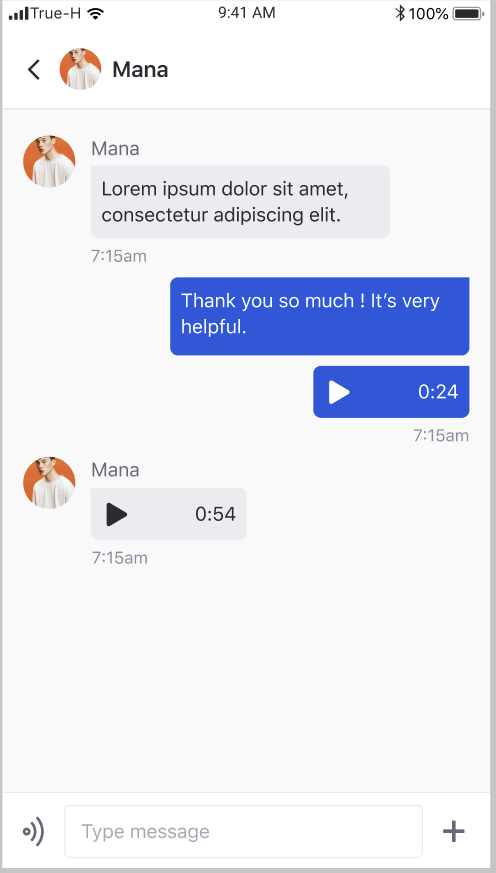
Show list of message
The latest message bubble will be on the bottom of the screen, and the user can scroll up to see all messages.
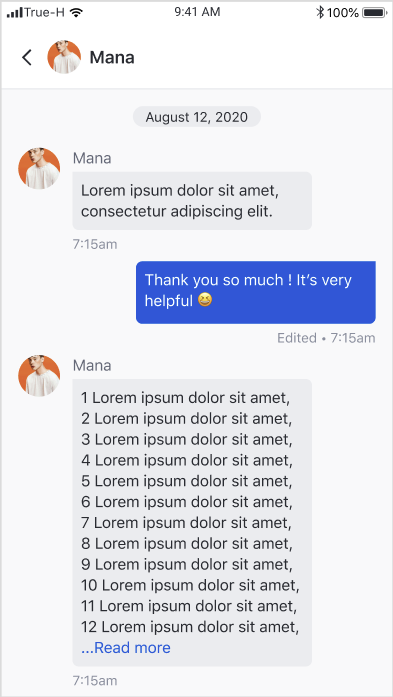
Date label
Grouping messages by the sent date.
Feature
Description
Read more mode.
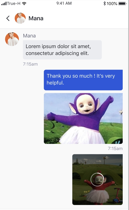
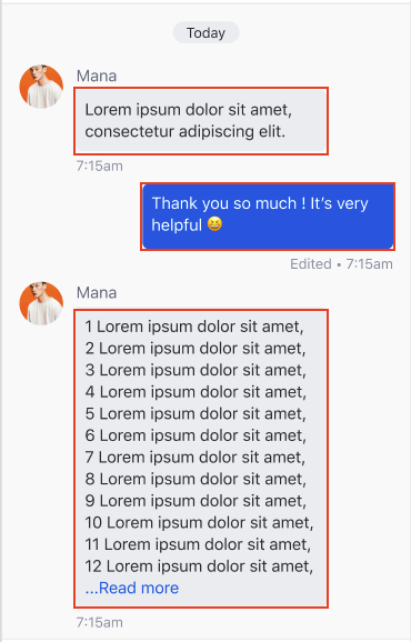
When the text is more than 13 lines, the system show read more mode. Once it is clicked on the read more button, it expands text to the full size.
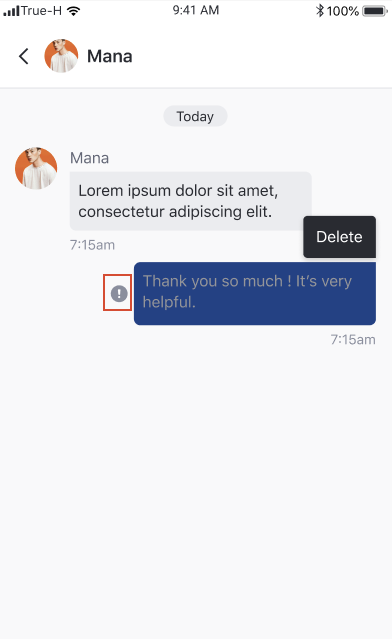
Long press to delete
If the long click event occurs, the system will show the delete option.
Long press to edit
If the long click event occurs, the system will show the edit option. When click the edit option, the system will redirect the user to the edit message page.
Error to send message indicator
If the message can not be sent, the system will show the error indicator in front of the message bubble.
Sent time stamp
Show as time stamp HH :MM
Edited label
If the message is edited , the edited label will be shown.
Deleted message
If the message is deleted , the deleted view will be shown.
Feature
Description
Image thumbnails
The system shows the image base on the image ratio. Once it is clicked, it will redirect the user to the edit message page.
Image upload state
The system will show the image uploading indicator while the image is being uploaded.
Feature
Description
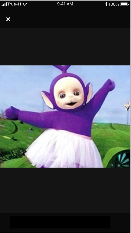
Pinch zoom gesture
The user can pinch the screen to zoom in or out the image.
back
Redirect user back to the previous page.
Feature
Description
Click to play
If the user clicks on the voice message , the system will play the audio
Click to stop
If the user clicks on the playing voice message or play another voice message, the system will stop playing the playing audio.
Feature
Description
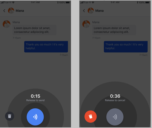
Hold to record
The user can hold to record an audio message for up to 60 seconds. Once the user releases the finger, the system will send the audio message.
Discard the record
The user can drag the finger to the bin button to discard the current recording session.
Feature
Description
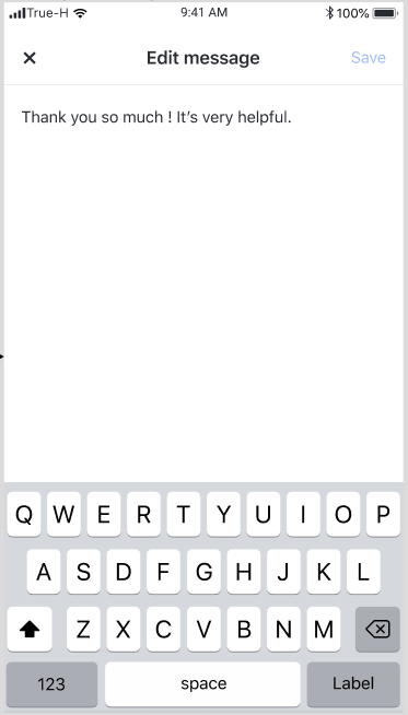
Add text
The user can update the text from the original input.
Save
The user can click save button to save the changes he made.
Discard change
The user can click 'x' to discard all changes before the user clicks save.
This component consists of two components; My community and Global feed components.
UIKit SDK 1.12.3 is released.
None
None
None
Fixed bug "Display promote to moderator option for member who was promoted"
Fixed crash community member
Fixed crash when create post on my timeline
None
OKHTTP - 3.10.0
Retrofit - 2.4.0
Kotlin-std-lib - 1.3.72
Amity Social SDK - 4.8.0
UIKit SDK 1.12.0 is released.
None
None
None
Edited comment on new feed is not update
Preview number of picture in post is not correct
Moderator can not add member on private community
Hyperlink on comment is not clickable
Add reply capabilities on comment feature
Add push notification settings for community level and user can turn on and off events that for receive notifications. the events user can setting -> post created, post reacted, comment created, comment replied and comment reacted
OKHTTP - 3.10.0
Retrofit - 2.4.0
Kotlin-std-lib - 1.3.72
Amity Social SDK - 4.8.0
UIKit SDK 1.11.0 is released.
None
None
None
Optimize 'image' post rendering performance
Fix missing 'like' count on 'read only' mode post
Fix delayed 'moderator' badge rendering
Fix incorrect orientation of category avatar
None
OKHTTP - 3.10.0
Retrofit - 2.4.0
Kotlin-std-lib - 1.3.72
Amity Social SDK - 4.7.1
UIKit SDK 1.11.0 is released.
Add support for custom rendering of post item. A map of dataType and custom renderer can be defined at EkoUIKitClient.feedUISettings
None
None
None
None
OKHTTP - 3.10.0
Retrofit - 2.4.0
Kotlin-std-lib - 1.3.72
Amity Social SDK - 4.7.0
UIKit SDK 1.9.1 is released.
None
None
None
Improve UI performances
None
OKHTTP - 3.10.0
Retrofit - 2.4.0
Kotlin-std-lib - 1.3.72
UIKit SDK 1.9.0 is released.
Add IPostShareClickListener; A delegate for handling click events on share menu options.
It can be applied at
Global level via EkoUIKitClient.feedUISettings"
Component level via
EkoMyFeedFragment.Builder
EkoCommunityFeedFragment.Builer
EkoGlobalFeedFragment.Builder
EkoPostDetailFragment.Builder
EkoUserFeedFragment.Builder
None
None
None
None
OKHTTP - 3.10.0
Retrofit - 2.4.0
Kotlin-std-lib - 1.3.72
When a user create community , he will automatically be moderator role of that community.
Moderator user can add member to community
Moderator user can remove member/other moderators from community
Moderator user can assign other member to be moderators.
Add validation for user display name to be up to 100 characters
iOS - adjust the color key to the correct key and shade.
API / Function change
User can Report Comment and un-report Comment
User can Report Post and un-report Post
User can Report User profile and un-report user Profile
Remove 3 dot icon in user profile page
API / Function change
Change sdk environment (upstra_sdk_config.xml) from "preprod" to "production"
Add reportComment/unReportComment functions
Add reportPost/unReportPost functions
Add reportUser/unReportUser functions
Chat : New message type : Audio message
Community : Pull the page to refresh
Add EkoPostSharingSettings ; A global level settings for post sharing options. Refer to documentation.
Refer to documentation.
Refer to on how to use these APIs to implement a "Share In / out" feature
Method | Description |
newsFeedFragmentDelegate | Fragment delegation for |
exploreFragmentDelegate | Fragment delegation for |
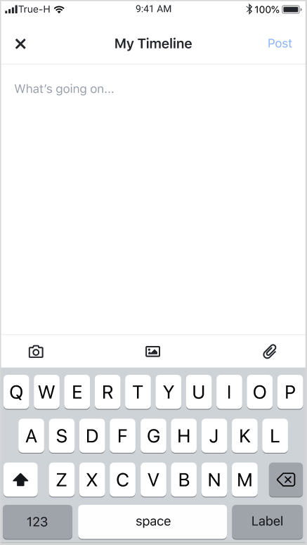
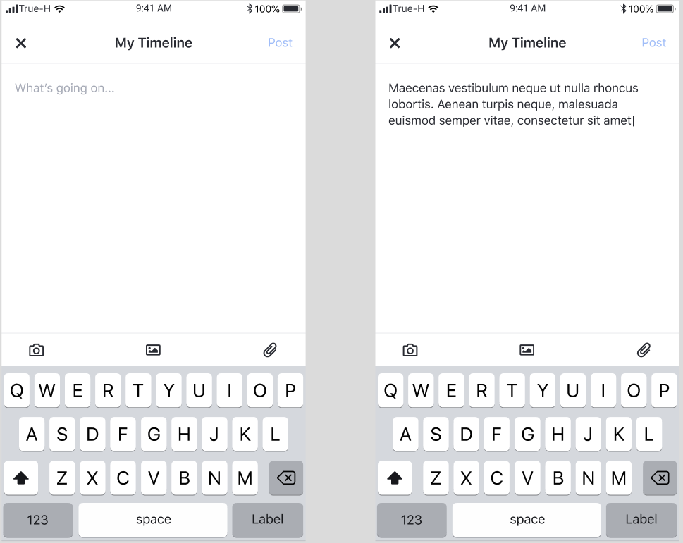
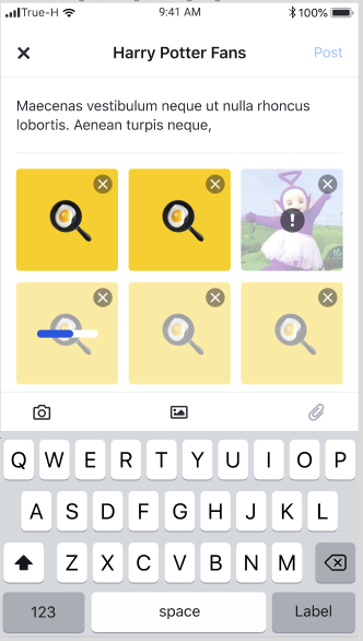
This page provides a form for post creation.
Feature
Description
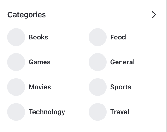
Category list
User can see up to eight categories sorted in alphabetical order.
Navigation to Category detail page
When a user clicks on a category item , the user is navigated to Category detail page.
Navigation to Category list
When a user selects the arrow, the user is navigated to Category list page.
Feature | Description |
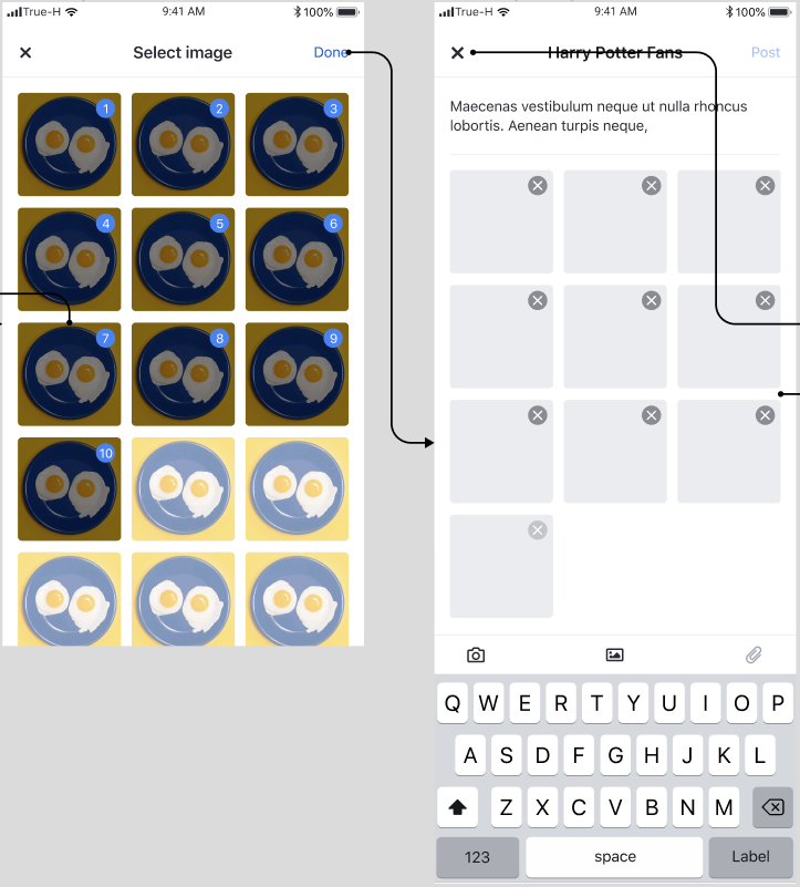
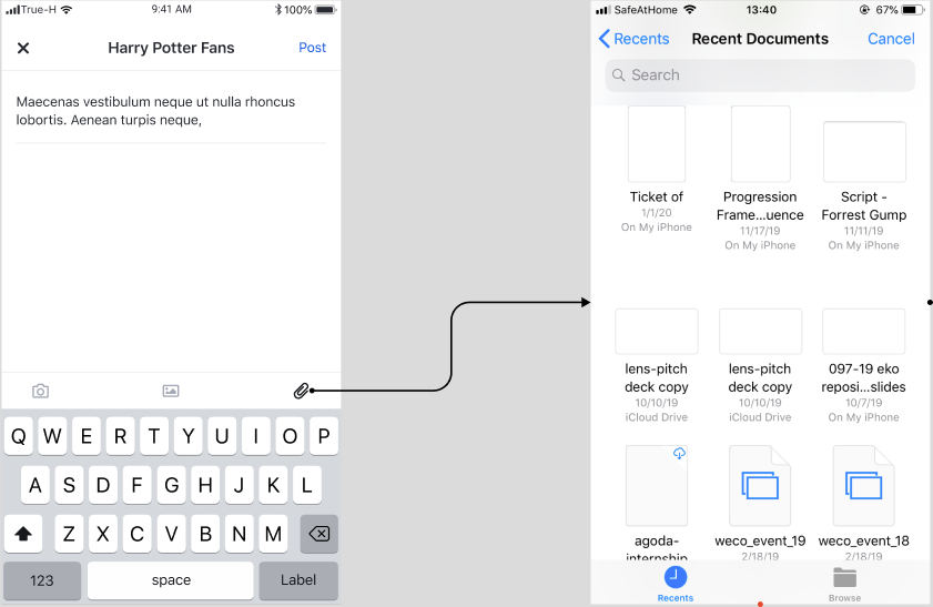
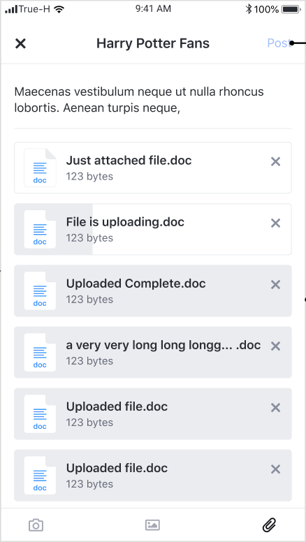
Post creation | User can create post by adding content such as text, images, and files. |
Feature | Description |
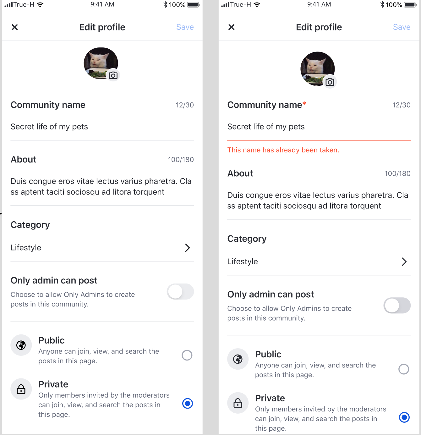
Community profile update | User can update the information such as avatar, community name, description, categories etc for this community. Profile will be updated upon tapping save button. |
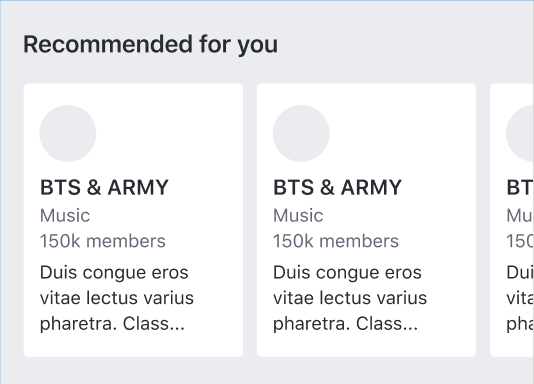
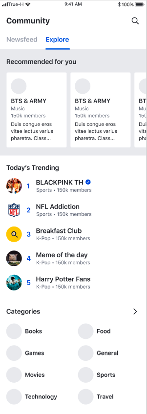
Feature | Description |
Recommended Community list | User can scroll horizontally to see up to four recommended communities. |
Navigation to Community profile |
When a user selects a community item , the user is navigated to
This component consists of three components; Recommend community, Top trending community, and Categories components.
Create a Fragment
A delegate can be passed to customise the components.
Method
Description
recommendedCommunityFragmentDelegate
Fragment delegation for EkoRecommendedCommunityFragment
trendingCommunityFragmentDelegate
Fragment delegation for EkoTrendingCommunityFragment
categoryPreviewFragmentDelegate
Fragment delegation for EkoCategoryPreviewFragment
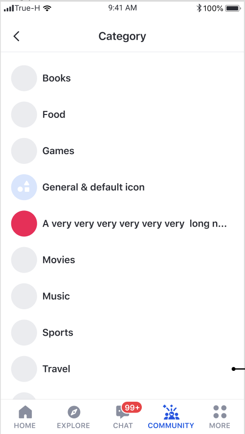
Feature
Description
Category list
User can see a list of all categories sorted in alphabetical order.
Navigation to Category detail page
When a user selects a category item, the user is navigated to Category detail page
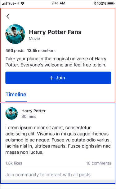
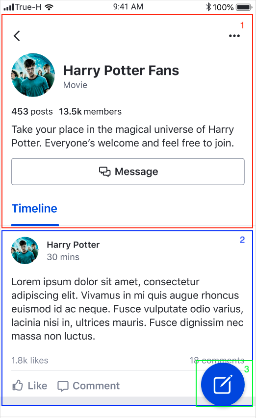
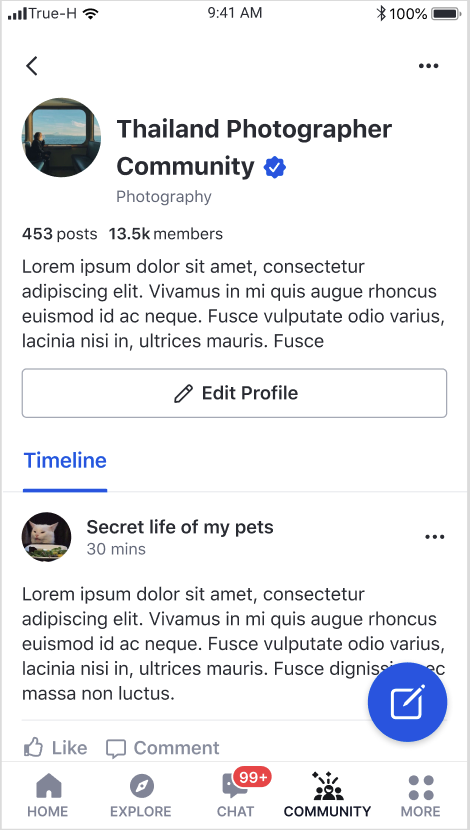
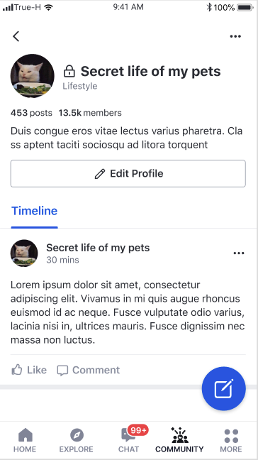
This page shows profile of a community including its own feed.
Feature
Description
Becoming a member
User can tap Join button to join a community
Post creation
User can tap the floating action button to open Post creation page
Community profile update
Creator can tap Edit profile button to open Community profile edit page
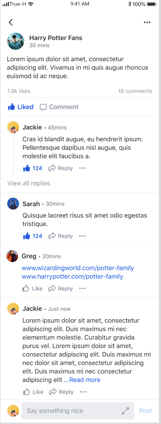
Feature
Description
Post content
User can view content of the post including reactions and comments.
Comment creation
User can create a comment by adding text to the compose bar and tapping Post button
Feature
Description
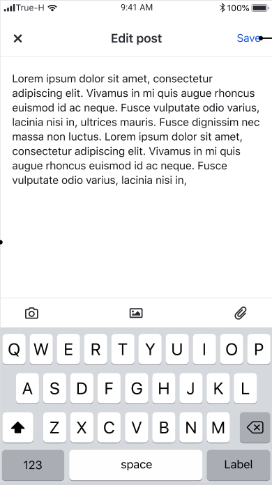
Text editing
User can edit text content.
Image removal
User can remove images.
File removal
User can remove files.
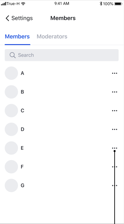
Feature
Description
Navigation to user profile page
User can view profile page by tapping on member list item
Report user
User can report members present in community
Feature
Description
Community feed
User can scroll vertically to see a list of posts from a community feed
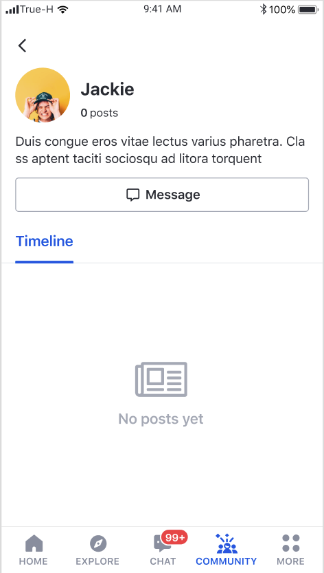
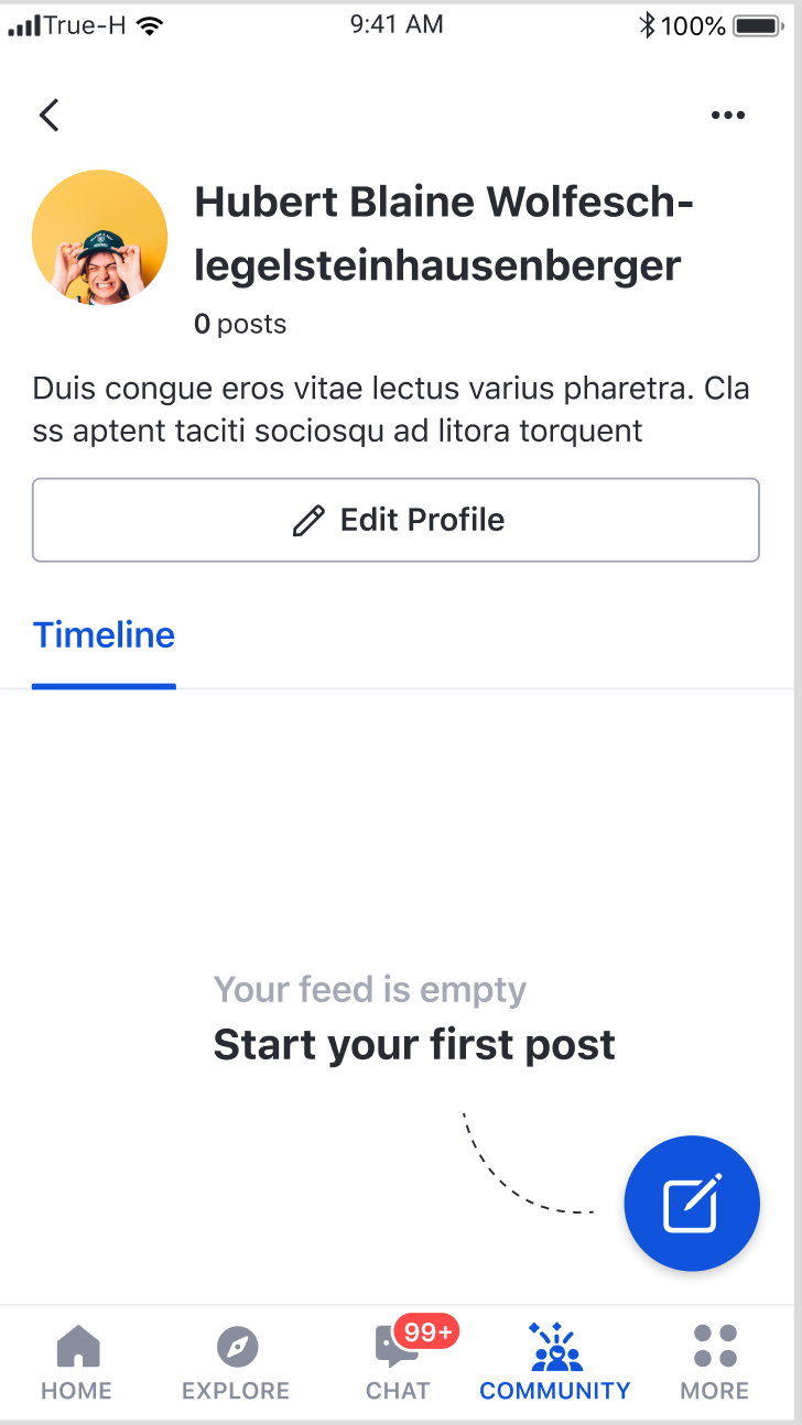
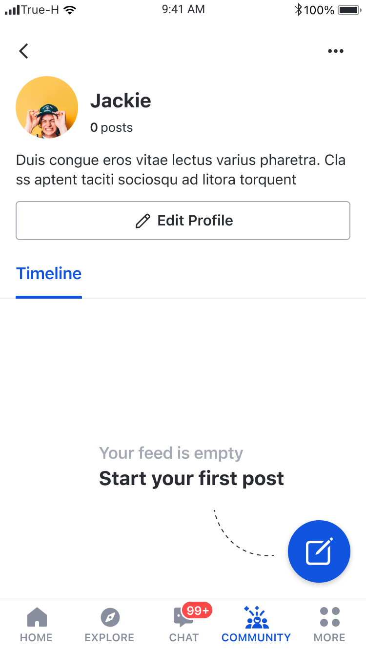
This page shows user profile information as well as user feed
Create a Fragment
A delegate can be passed to customise the components.
Feature
Description
User Profile
User can view display name and description
Post creation
User can tap the floating action button to open Post creation page to create a post on user's own page
User profile update
User can tap Edit profile to open User profile edit page to update user's own profile
Method
Description
feedFragmentDelegate
Fragment delegation for EkoFeedFragment
Feature
Description
Post creation on user's own feed
When a user selects My Timeline, UIKit will open Post Creation page with the user's own feed as the target.
Post creation on community feed
When a user selects a community, UIKit will open Post Creation page with the selected community.
Feature
Description
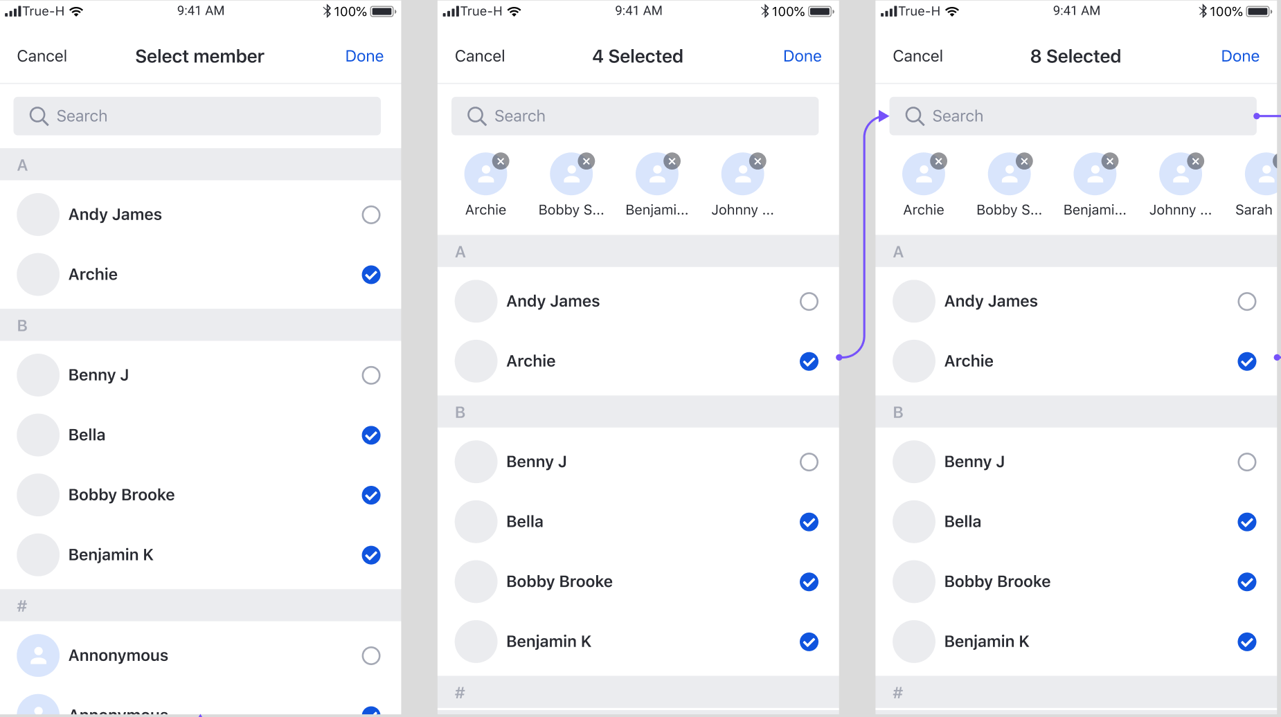
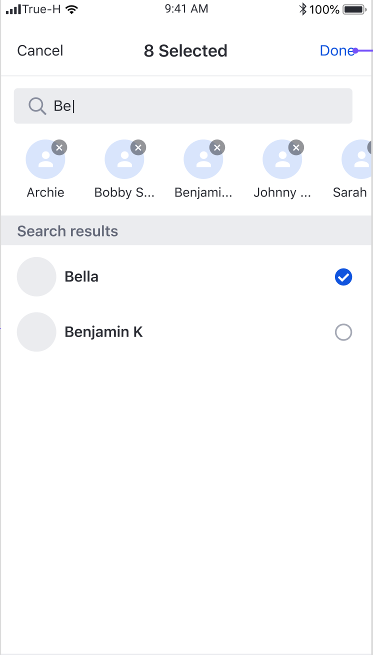
Member Selection
User can select a list of users