Loading...
Loading...
Loading...
Loading...
Loading...
Loading...
Loading...
Loading...
Loading...
Loading...
Loading...
Loading...
Loading...
Loading...
Loading...
Loading...
Loading...
Loading...
Loading...
Loading...
Loading...
Loading...
Loading...
Loading...
Loading...
Loading...
Loading...
Loading...
Loading...
Loading...
Loading...
Loading...
Loading...
Loading...
Loading...
UIKIT will allow some parts of the component to be replaceable with your own component.
Loading...
UIKIT allows the default behaviour to be overridden by custom logic.
Loading...
Loading...
Loading...
Loading...
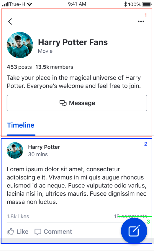
Our chat functionality within the UIKit will allow you to explore how to best integrate and design messaging features and visually see how they will look in your app
Loading...
Loading...
Loading...
Loading...
Loading...
UIKIT allows some parts of the component to be replaceable with your own component.
Loading...
Loading...
Loading...
Loading...
Loading...
Loading...
Loading...
Our community group functionality within the UIKit will allow you to explore social features and how they will look in your app
Loading...
Loading...
Loading...
Loading...
Loading...
Loading...
Loading...
Loading...
Loading...
Loading...
Loading...
Loading...
Loading...
Loading...
Loading...
Loading...
Loading...
Loading...
Loading...
Loading...
Loading...
Loading...
Loading...
Loading...
Loading...
Loading...
UIKIT allows some parts of the component to be replaceable with your own component.
Loading...
UIKIT allows the default behaviour to be overridden by custom logic.
Loading...
Loading...
Loading...
Loading...
Our chat functionality within the UIKit will allow you to explore how to best integrate and design messaging features and visually see how they will look in your app
Loading...
Loading...
Loading...
Method
Description
myCommunityPreviewViewMaker
If you set this handler to the view controller, my community view will be replaced by the view passed through this block.
globalFeedViewMaker
If you set this handler to the view controller, global feed view will be replaced by the view passed through this block.
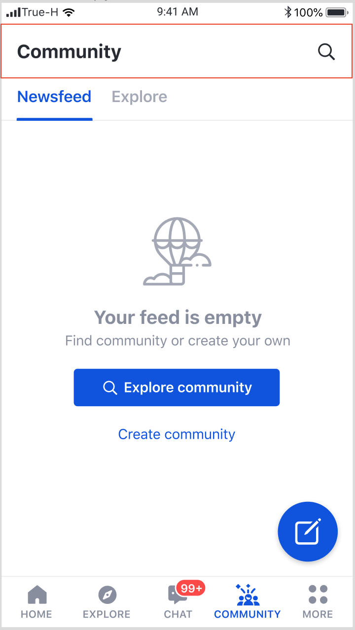
This component consists of two components; My community and Global feed components.
Create a view controller
In case you want to replace any of our default view, we provide view maker handlers in order to replace by custom view.
Method
Description
myCommunityPreviewViewMaker
If you set this handler to the view controller, my community view will be replaced by the view passed through this block.
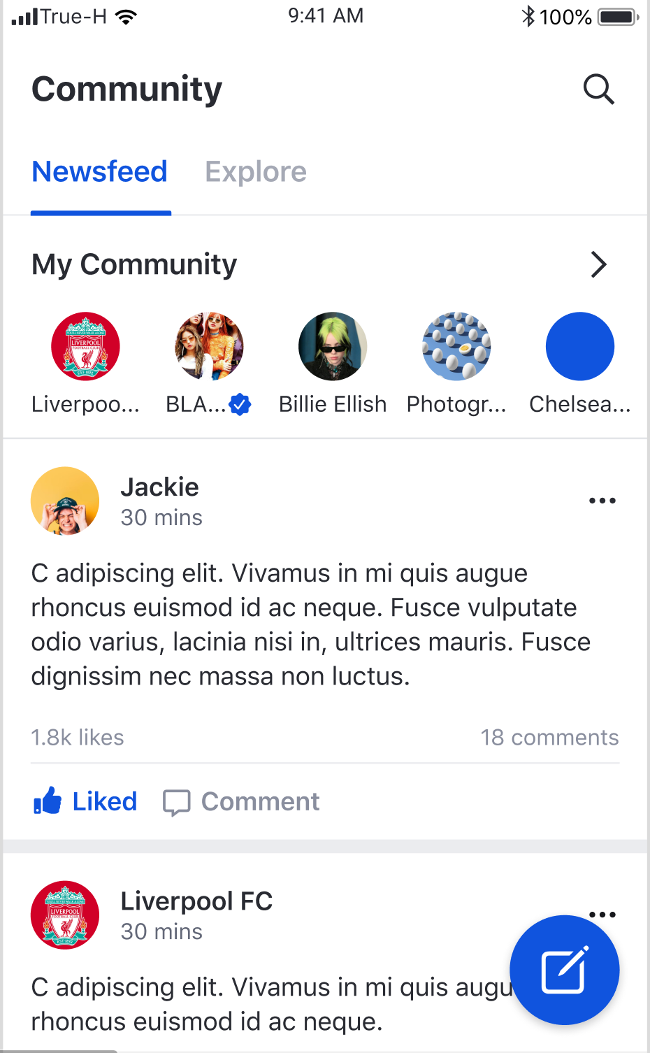
Feature | Description |
Global feed | User can scroll vertically to see a list of posts from the global feed. |
Feature | Description |
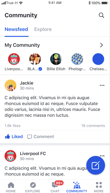
My Community list | User can scroll horizontally to see a list of up to eight communities that the user has joined sorted in alphabetical order. |
Navigation to Community profile page |
Navigation to My community page |
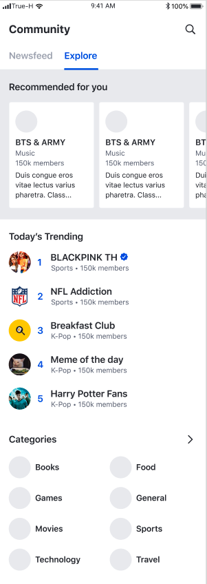
Feature | Description |
Recommended Community list | User can scroll horizontally to see up to four recommended communities. |
Navigation to Community profile |
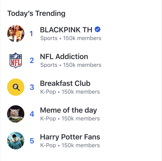
Feature | Description |
Top trending Community list | User can see up to five top trending communities. |
Navigation to Community profile |
When a user selects an community item, the user is navigated to
When a user selects the arrow, the user is navigated to
When a user selects a community item , the user is navigated to
When a user selects a community item , the user is navigated to
Feature
Description
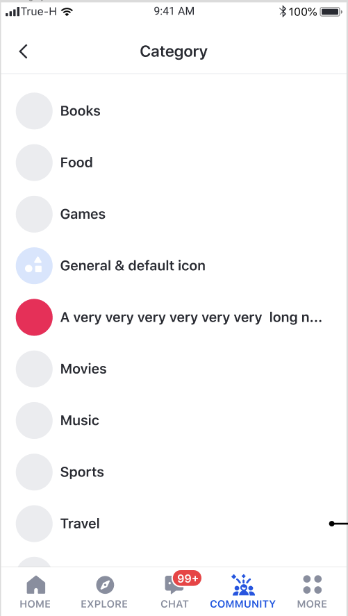
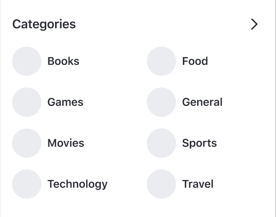
Category list
User can see up to eight categories sorted in alphabetical order.
Navigation to Category detail page
When a user clicks on a category item , the user is navigated to Category detail page.
Navigation to Category list
When a user selects the arrow, the user is navigated to Category list page.
Feature
Description
Navigation to user profile page
User can view profile page by tapping on member list item
Report user
User can report members present in community
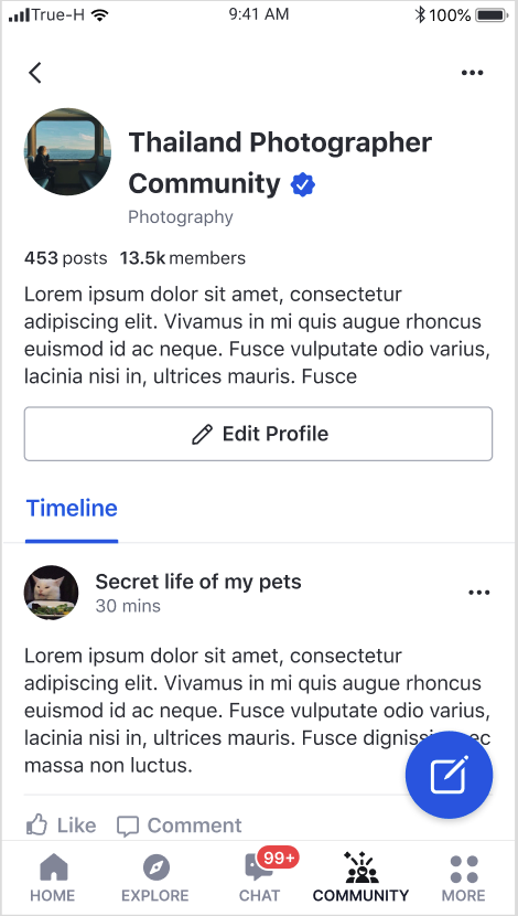
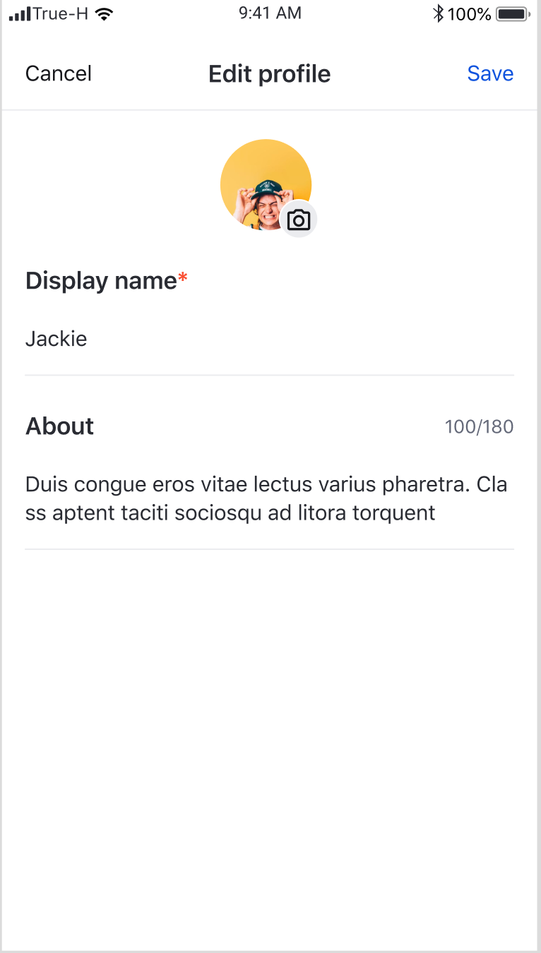
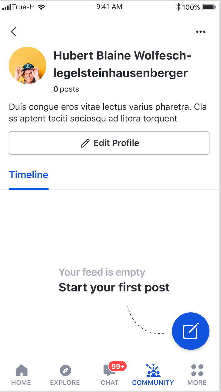
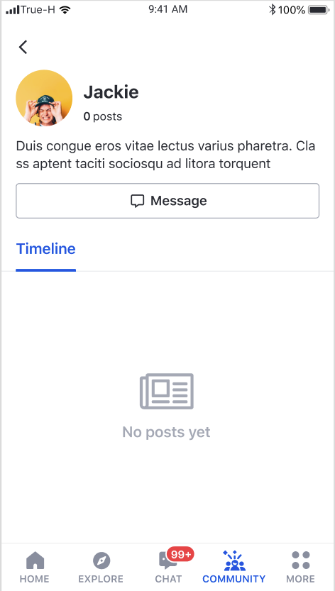
This page shows user profile information as well as user feed
Feature
Description
User Profile
User can view display name and description
Post creation
User can tap the floating action button to open Post creation page to create a post on user's own page
User profile update
User can tap Edit profile to open User profile edit page to update user's own profile
Method
Description
newsFeedFragmentDelegate
Fragment delegation for EkoNewsFeedFragment
exploreFragmentDelegate
Fragment delegation for EkoExploreFragment
This component consists of two components; My community and Global feed components.
This component consists of three components; Recommend community, Top trending community, and Categories components.
Create a Fragment
A delegate can be passed to customise the components.
Method
Description
recommendedCommunityFragmentDelegate
Fragment delegation for EkoRecommendedCommunityFragment
trendingCommunityFragmentDelegate
Fragment delegation for EkoTrendingCommunityFragment
categoryPreviewFragmentDelegate
Fragment delegation for EkoCategoryPreviewFragment
Feature
Description
Recommended
Community list
User can scroll horizontally to see up to four recommended communities.
Navigation to Community profile
When a user selects a community item , the user is navigated to Community Profile page
Feature
Description
Top trending
Community list
User can see up to five top trending communities.
Navigation to Community profile
When a user selects a community item , the user is navigated to Community Profile page
Feature
Description
Category list
User can see a list of all categories sorted in alphabetical order.
Navigation to Category detail page
When a user selects a category item, the user is navigated to Category detail page
Feature
Description
Category list
User can see up to eight categories sorted in alphabetical order.
Navigation to Category detail page
When a user clicks on a category item , the user is navigated to Category detail page.
Navigation to Category list
When a user selects the arrow, the user is navigated to Category list page.
Feature
Description
Community list by category
User can see a list of all communities that belong to a category sorted in alphabetical order.
Navigation to Community Profile page
When a user selects a community item, the user is navigated to Community Profile page
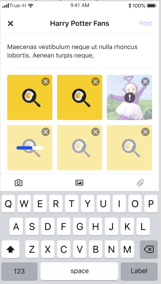
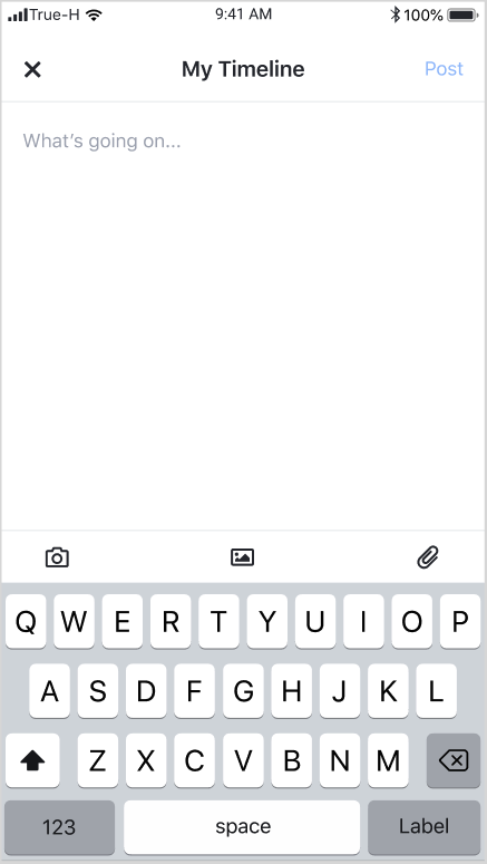
This page provides a form for post creation.
Feature
Description
Post creation
User can create post by adding content such as text, images, and files.
Feature
Description
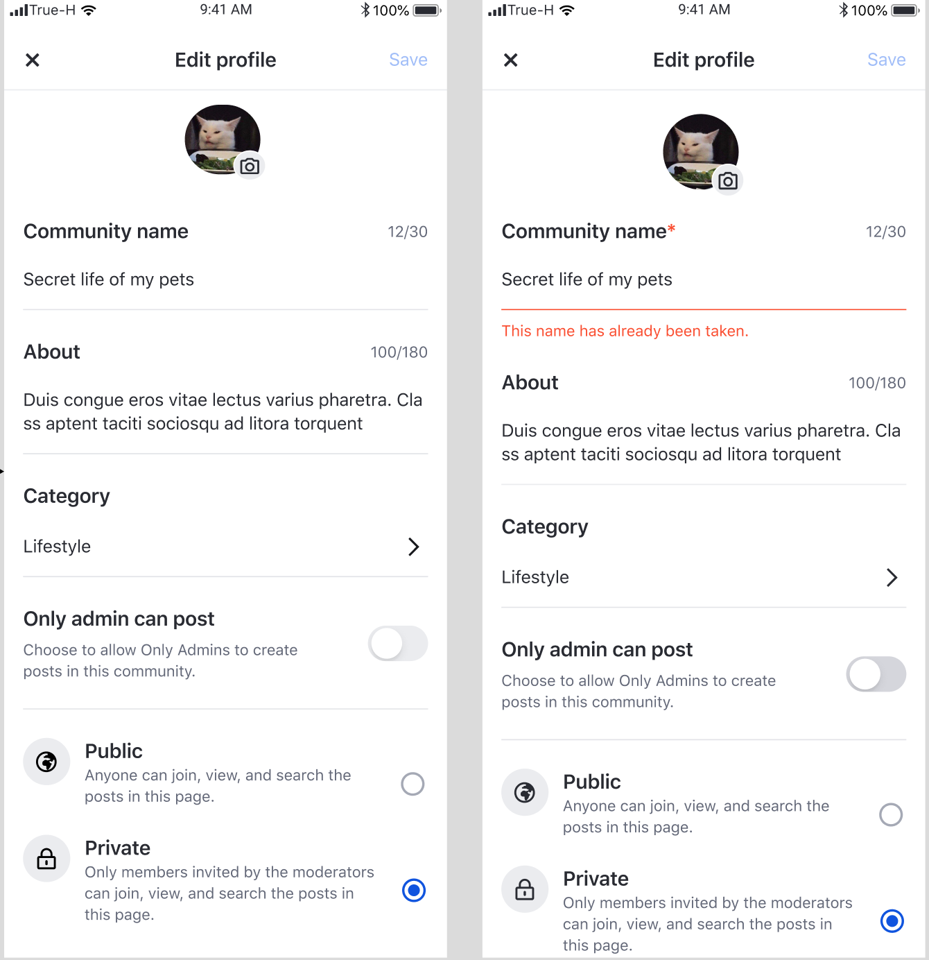
Community profile update
User can update the information such as avatar, community name, description, categories etc for this community. Profile will be updated upon tapping save button.
Feature | Description |
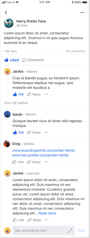
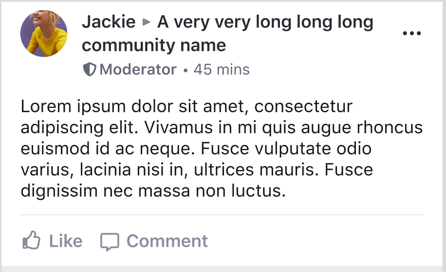
Post content | User can view content of the post including reactions and comments. |
Comment creation | User can create a comment by adding text to the compose bar and tapping Post button |
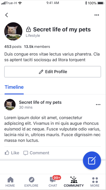
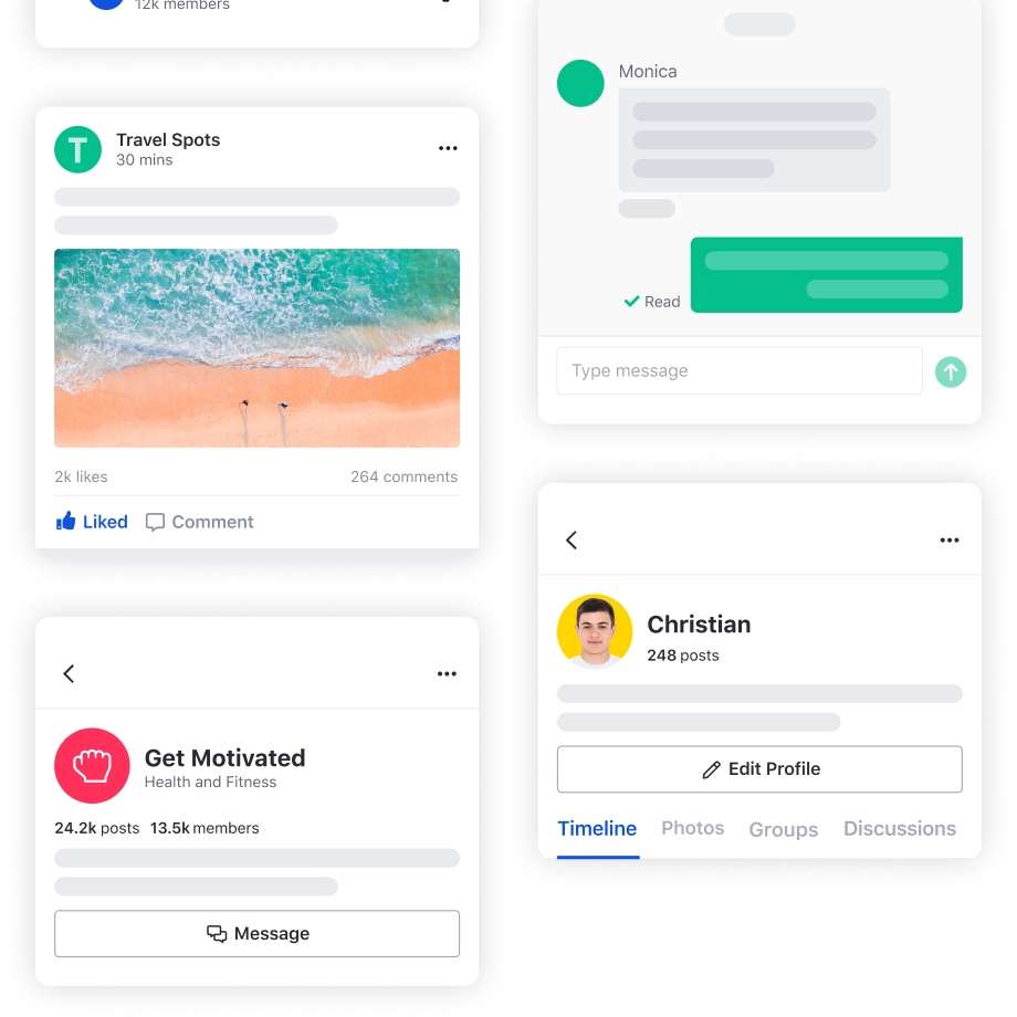
This page shows profile of a community including its own feed.
Feature
Description
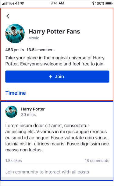
Becoming a member
User can tap Join button to join a community
Post creation
User can tap the floating action button to open Post creation page
Community profile update
Creator can tap Edit profile button to open Community profile edit page
Feature
Description
Text editing
User can edit text content.
Image removal
User can remove images.
File removal
User can remove files.
Feature
Description
Community feed
User can scroll vertically to see a list of posts from a community feed
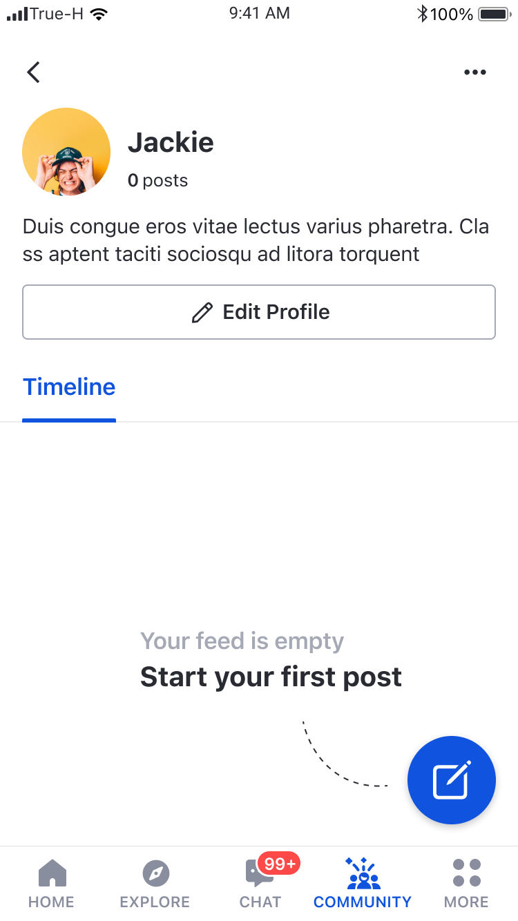
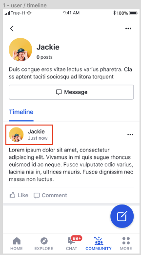
This page shows user profile information as well as user feed
Create a Fragment
A delegate can be passed to customise the components.
Feature
Description
User Profile
User can view display name and description
Post creation
User can tap the floating action button to open Post creation page to create a post on user's own page
User profile update
User can tap Edit profile to open User profile edit page to update user's own profile
Method
Description
feedFragmentDelegate
Fragment delegation for EkoFeedFragment
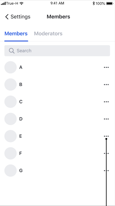
Feature
Description
Navigation to user profile page
User can view profile page by tapping on member list item
Report user
User can report members present in community
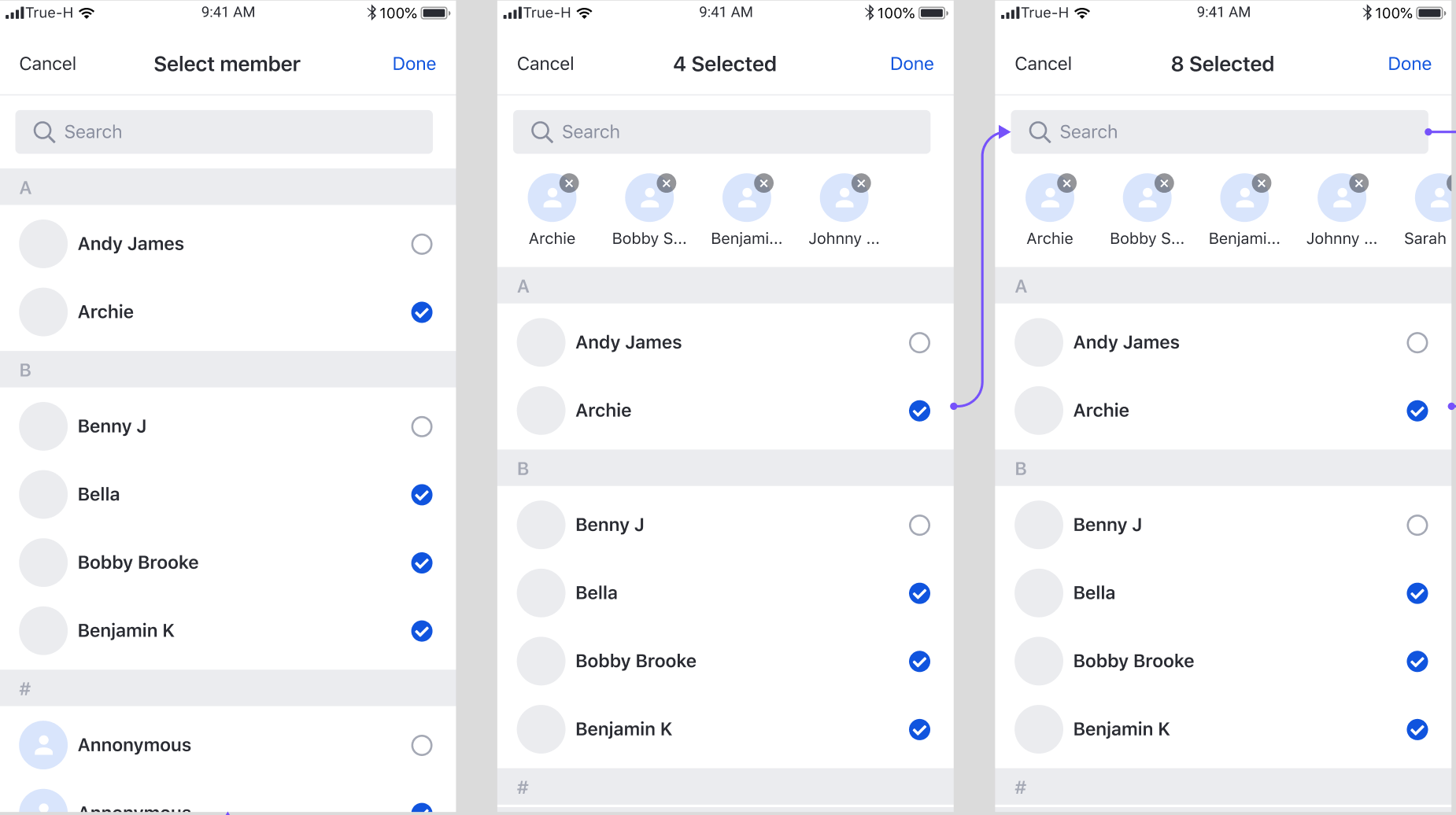
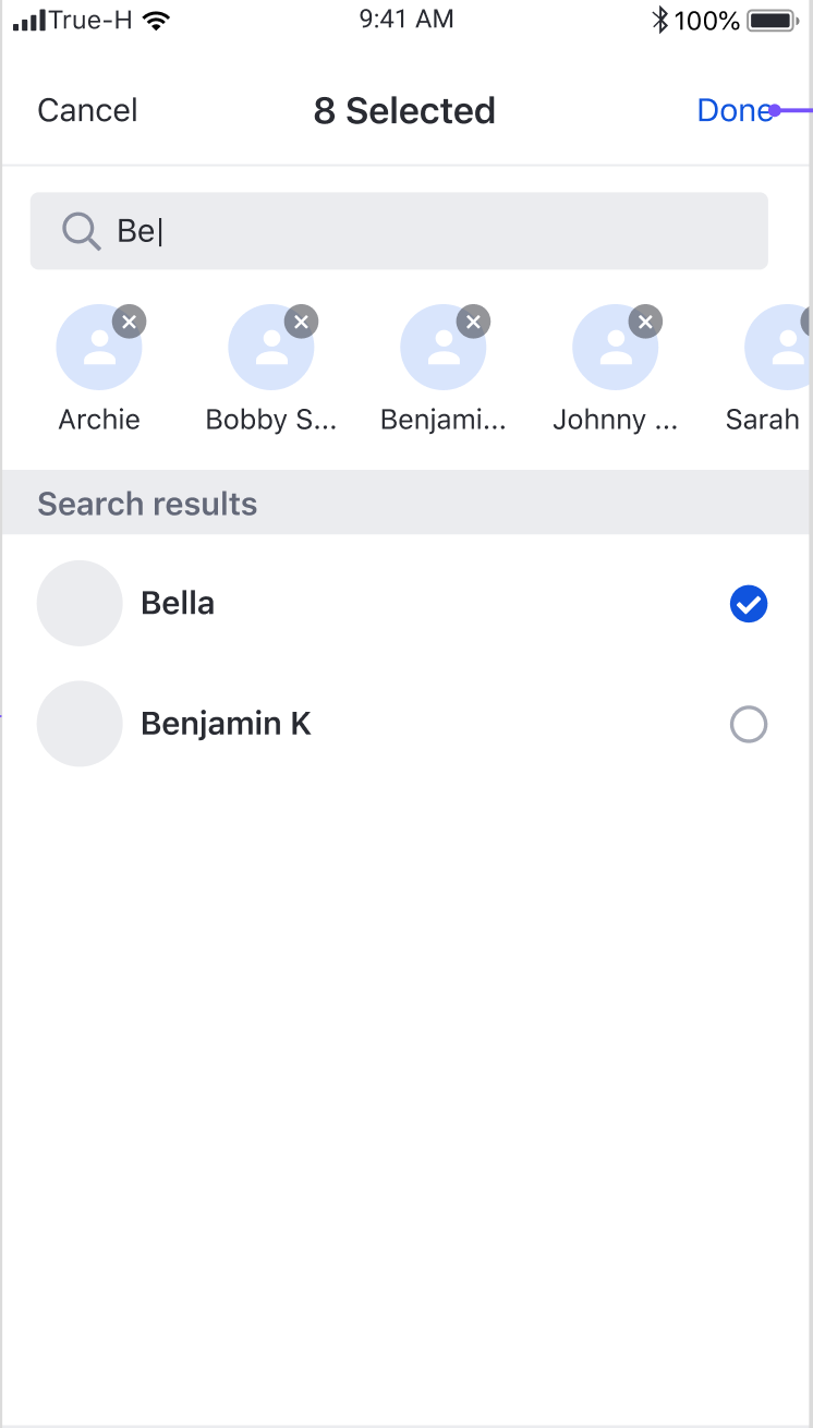
Feature
Description
Member Selection
User can select a list of users
Feature
Description
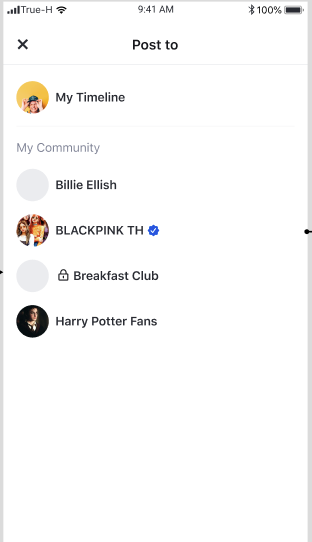
Post creation on user's own feed
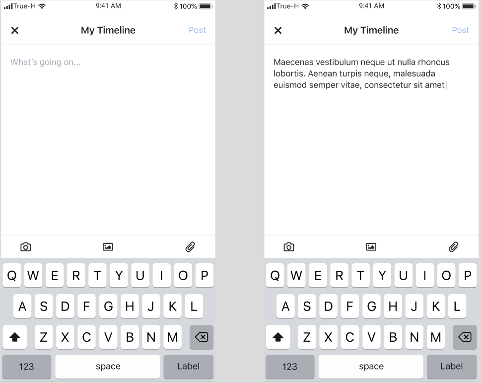
When a user selects My Timeline, UIKit will open Post Creation page with the user's own feed as the target.
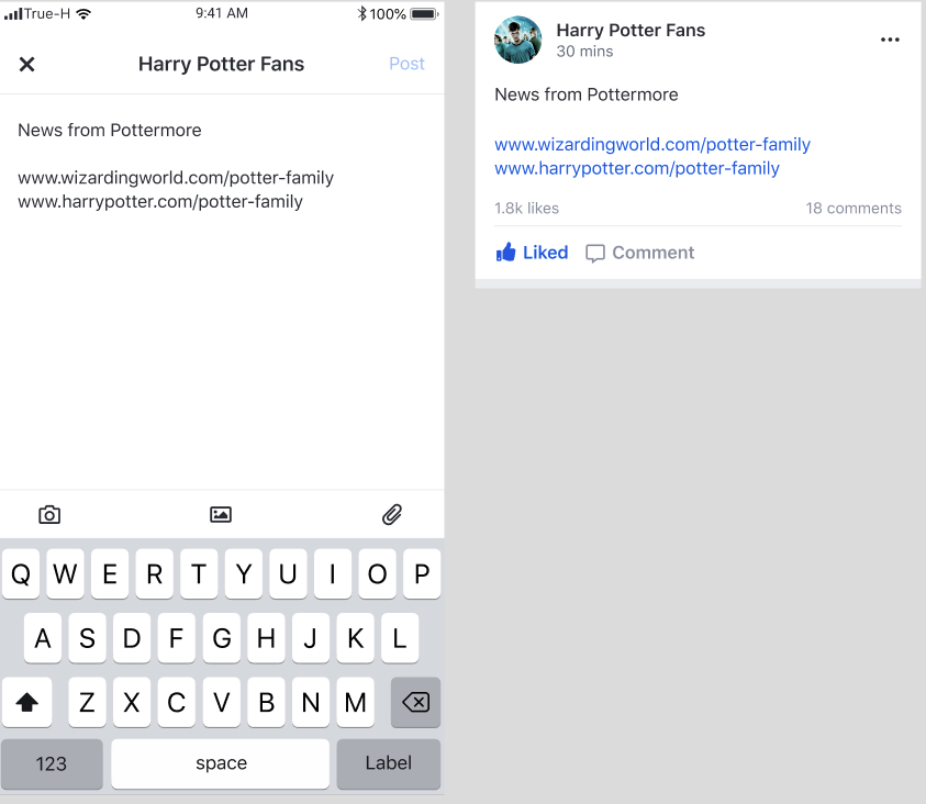
Post creation on community feed
When a user selects a community, UIKit will open Post Creation page with the selected community.
Amity modules are ready-to-use — the only things left to do for our customers are integration and frontend. Going the extra mile, we've created a UIKit with endless customisations.
There are many components that you can use and integrate into your existing application.
Amity UIKit provides already built UI elements on single page. You can change the appearance, such as colour and typography, in the global settings. However, the UIKit does not allow you to replace these small components with other views. In addition, you cannot modify the view hierarchy inside the page.
iOS 11.0 or higher
Swift 5
Xcode 11.7
Our sample application has the core features of the Amity UIKit, just so you can discover all the sample UIKit’s before building your own project.
Coming soon!
The UIKit API provides several strategies to integrate with your application.
Use the UIKit as is.
Integrate the Chat experience in the least amount of effort.
Add a custom theme to the default implementation of the UIKit.
Complete control of the visual style of Chat UI by implementing declarative styles (fonts and colours) for your user interface.
Use key components from the UIKit SDK and integrate them directly into your application.
Add the Chat UI to your existing design.
The UIKit is built on the foundation of the Amity API while adding a UI layer to speed product development efforts. At the core it is leveraging the same Channel, Messaging concepts, subscribing to live objects whilst adding a UIKit to accelerate product delivery and UI that delivers great user experience for companies wanting to deploy messaging.
In the current state, there are two modules that can be used. You can follow the steps below. These two modules can be integrated into your application easily in no time.
Module
Description
User can create community, create post content and see new content generate via Feed
User can see list of their friends and start a new chat room - 1:1 or group - with them
Go to Xcode and create a project for iOS.
Enter a project name
Select Swift as your language option
UIKit for iOS supports both Carthage and CocoaPods.
Carthage
Carthage is a decentralised dependency manager that builds your dependencies and provides you with binary frameworks. To integrate the Amity Social UIKit. First add the following to your Cartfile.
Now you can install Amity Social UIKit into your project by running the following command.
CocoaPods
If you are using CocoaPods to integrate Amity Social UIKit into your Xcode project. First, open a terminal and run this command to create Podfile.
Then, add the following lines to the Podfile
Now you can install Amity Social UIKit into your project.
After finished installing SDK through Carthage or CocoaPods. You will be able to import UpstraUIKit.
Please check if you have git-lfs installed and clear cocoapod cache before running install again
To clear cache please go to ~/Library/Caches/Cocoapods/ and remove Amity SDK folder - you should be able to run a clean install afterward
If this doesn't work, please do visit the cocoapod Github repo for further resolutions.
With Amity UIKit SDK 4.1, we have introduce a new way to Authentication process. Please follow the guide below
UIKit requires an API key, you will need a valid API key to begin using the UIKit.
To use any SDK feature, you must first register the current device with an userId. A device registered with an userId will be permanently tied to that userId until you explicitly unregister the device, or until the device has been inactive for more than 90 days. A device registered with a specific userId will receive all messages belonging to that user.
Additionally, an optional displayName can be provided if you wish to have this user identified in push notifications.
In the event that your user logs out, you should explicitly unregister the user from the SDK as well, to prevent the current device from receiving any unnecessary or restricted data.
UIKit uses the default theme as part of the design language.
With no customisation UIKit already looks good
However, if you wish to customise the theme, you can declare changes to both colours and typography.
UIKit uses a small set of declared colours to simplify the design task for developers. These colours are automatically rendered at appropriate shades to communicate states and interaction to the users.
To declare your own colours on iOS.
Declare a variable of the provided class EkoTheme
Set the custom theme on the client instance
Color | Description | Default |
Primary | Used for buttons and primary call to actions | #1054DE |
Secondary | Used in secondary UI elements | #292B32 |
Alert | Used when informing users of errors or information that requires an attention. | #FA4D30 |
Highlight | Used for hyperlink text | #1054DE |
Base | Text presented on light background | #292B32 |
Base Inverse | Text presented on dark background | #FFFFFF |
Message Bubble | Background colour of message bubble sent by the user | #1054DE |
Message Bubble Inverse | Background colour of message bubble sent to the user | #EBECEF |
Feature
Description
Community list by category
User can see a list of all communities that belong to a category sorted in alphabetical order.
Navigation to Community Profile page
When a user selects a community item, the user is navigated to Community Profile page
Feature
Description
My community list
User can scroll vertically to see a list of communities that the user has joined sorted in alphabetical order.
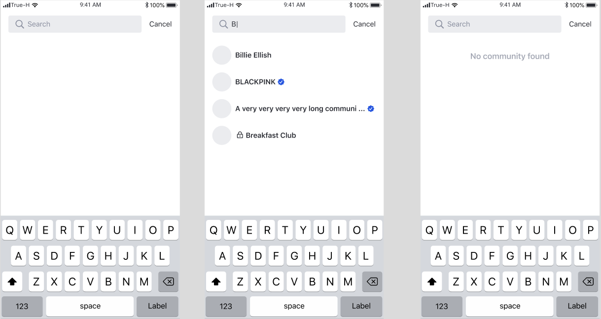
Community search
User can search for community by name
Community creation
User can click on + button , to open Community Creation page
Feature
Description
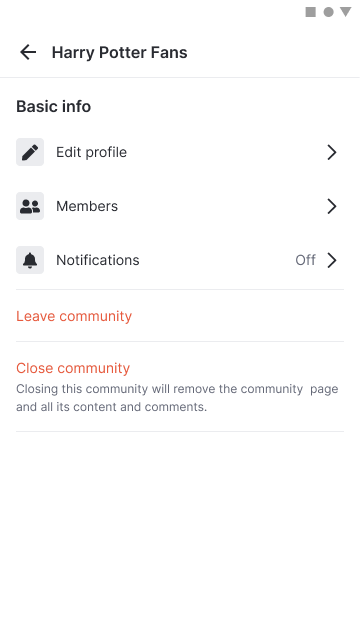
Leave community
User can leave the viewing community by click on leave community button
edit community profile page(moderator user)
User can see and access to Community Profile Edit Page if the user is the moderator.
Close community(moderator user)
User can see and perform close community option if the user is the moderator.
Community member page
User can access to Community member page
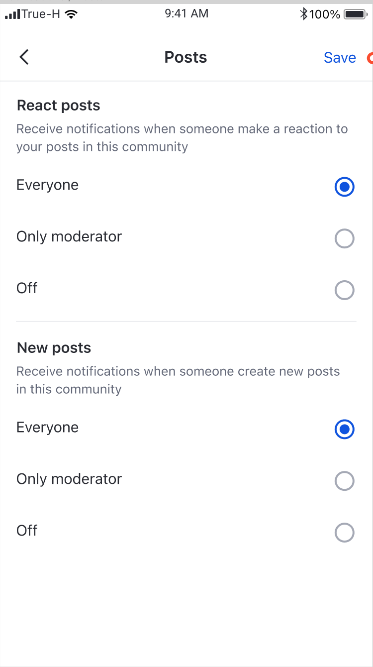
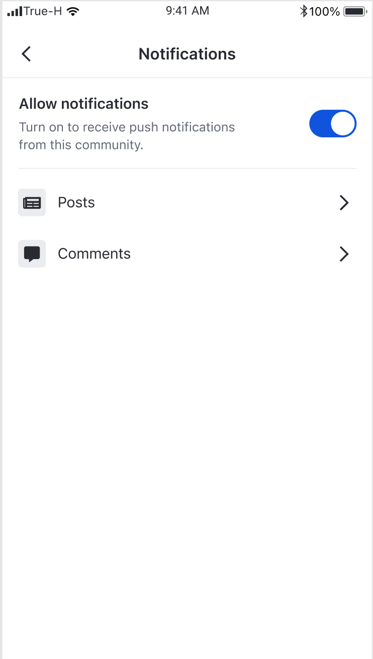
Community Notification setting
User can see the notification setting status and can access to the Community Push notification setting page
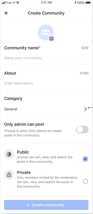
Feature
Description
Community creation
User can create a community by filling the required fields and tapping the Create community button
Parameter
Description
viewType
enums to determine what the view type should be
consist of create and edit(communityId: String) types
Feature
Description
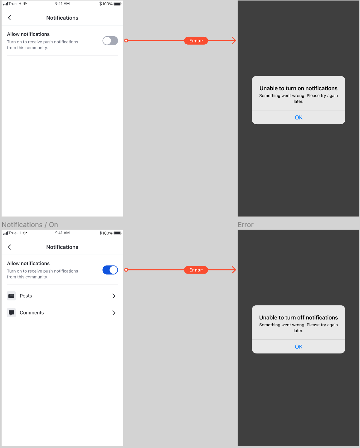
toggle on/off notification community level setting
User can choose to toggle on / off the notification setting for this specific community
Hide disable notification setting.
User will not see the push notification that has been turn off.
error state handle
when use try to change the status of the community push notification setting but not success due to get error from Backend , we will show pop up and return the toggle state to before the change,
Feature
Description
Category list
User can see a list of all categories sorted in alphabetical order.
Navigation to Category detail page
When a user selects a category item, the user is navigated to Category detail page
Feature
Description
Community profile update
User can update the information such as avatar, community name, description, categories etc for this community. Profile will be updated upon tapping save button.
This page provides a form for post creation.
Create a view controller
Parameter
EkoCommunityModel is a wrapper class of EkoCommunity which is a live object from EkoChat
Parameter
Description
postTarget
enums to determine where is the target feed
consist of myFeed and community(EkoCommunityModel)
Feature
Description
toggle on/off notification community level setting
Users can choose to toggle on / off the notification setting for this specific community
Hide disable notification setting.
Users will not see push notifications that have been turned off
error state handle
When users try to Change the status of the community push notification setting and get an error from our back-end due to a failed attempt
Feature
Description
toggle on/off notification community level setting
Users can choose to toggle on / off the notification setting for this specific community
Hide disable notification setting.
Users will not see push notification that have been turned off
error state handle
when users try to change the status of the community push notification setting and get an error from our back-end due to a failed attempt
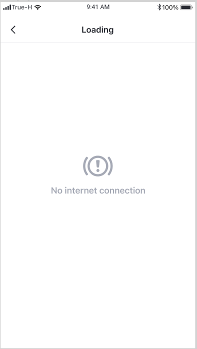
No internet connection state
if users do not have a stable internet connection, the system will show the error as stated
This page shows profile of a community including its own feed.
Feature
Description
Becoming a member
User can tap Join button to join a community
Post creation
User can tap the floating action button to open Post creation page
Community profile update
Creator can tap Edit profile button to open Community profile edit page
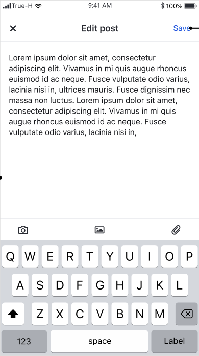
This page provides a form to edit post content.
Feature
Description
Post content
User can view content of the post including reactions and comments.
Comment creation
User can create a comment by adding text to the compose bar and tapping Post button
Feature
Description
Text editing
User can edit text content.
Image removal
User can remove images.
File removal
User can remove files.
Parameter
Description
postTarget
enums to determine where is the target feed
consist of myFeed and community(EkoCommunityModel)
post
EkoPost is a live object from EkoChat
Feature
Description
Community feed
User can scroll vertically to see a list of posts from a community feed
Feature
Description
User profile update
User can update the information such as avatar, display name, and description. Profile will be updated upon tapping save button.
This settings allows you to control where a post can be shared to based on the post origin.
My feed - The post can be shared to my feed. This option will enable "Share to my timeline" menu when user clicks share button.
Public community - The post can be shared to any public community. This option will enable "Share to group" menu when user clicks share button.
Private community - The post can be shared to any private community. This option will enable "Share to group" menu when user clicks share button.
External - The post can be shared externally. This option will enable "More options" menu when user clicks share button.
Origin - The post can be shared within the community feed that it was created. If the post was created in either public or private community, this option will enable "Share to group" menu when user clicks share button.
My feed post - Posts that were created on my feed. By defaults, possible sharing targets are My feed, Public community, and Private community.
User feed post - Posts that were created on any other users' feed. By defaults, possible sharing targets are My feed, Public community, and Private community.
Public community feed post - Posts that were created on any public community. By defaults, possible sharing targets are My feed, Public community, and Private community.
Private community feed post - Posts that were created on any private community. By defaults, possible sharing target is Origin.
You can select a set of targets for each post origin.
Based on Post sharing settings, there are up to three post sharing events that can be emitted by UIKit.
Share to my timeline - an event emitted when a user clicks on "Share to my timeline" button.
Share to group - an event emitted when a user clicks on "Share to group" button.
Share externally - an event emitted when a user clicks "More options" button.
You can choose to intercept one or all of the events and apply your custom behaviour.
Feature
Description
User feed
User can scroll vertically to see a list of posts from a user feed
Feature
Description
Post creation on user's own feed
When a user selects My Timeline, UIKit will open Post Creation page with the user's own feed as the target.
Post creation on community feed
When a user selects a community, UIKit will open Post Creation page with the selected community.
Feature | Description |
Member Selection | User can select a list of users |
There are many pages and actions on AmityUIKit. Pages can be nested inside other and it would be hard for overriding events on the nested pages. In order to solve this problem, we provide EkoEventHandler which is a behavior controller for actions that happens in UIKit.
Event
Parameter
Condition
communityDidTap
communityId
community avatar or community display name is tapped
userDidTap
userId
user avatar or user display name is tapped
editUserDidTap
userId
edit user button is tapped
postDidtap
postId
post or comment on social feed is tapped
editPostDidTap
postId
edit post button is tapped
channelDidTap
channelId
user channel list or user chat button is tapped
communityChannelDidTap
channelId
n/a
There are many components that you can use and integrate into your existing application.
UIKit provides already built UI elements in one page. You can change the appearances, such as colour and typography in the global settings. However, UIKit does not allow you to replace these small components with other views. And you cannot modify the view hierarchy inside the page.
From v1.8 onwards, UIKit provides the capability for you to manage roles & permissions via the integration with SDK
Permissions
Description
Add user
Moderator user can add new member to the community.
Remove user
Moderator user can remove member from the community.
Assign Moderator role to other users
Moderator user can assign Moderator role to another member in the same community
Remove Moderator role from a Moderator user
Moderator user can remove Moderator role from another Moderator in the same community
Edit community
Moderator user can rename community, change community type as he see fit
Close community
Moderator user can close the community
Moderator badge
the "Moderator" badge shown on the post indicates it was created by a moderator user
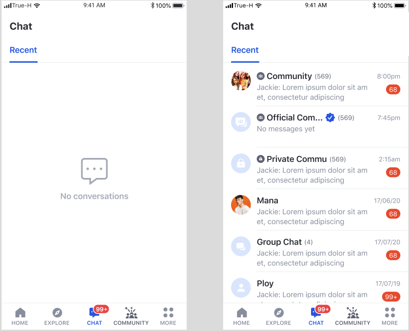
Feature
Description
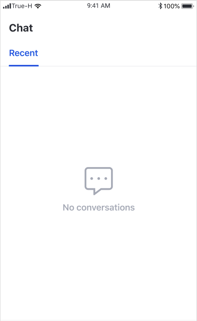
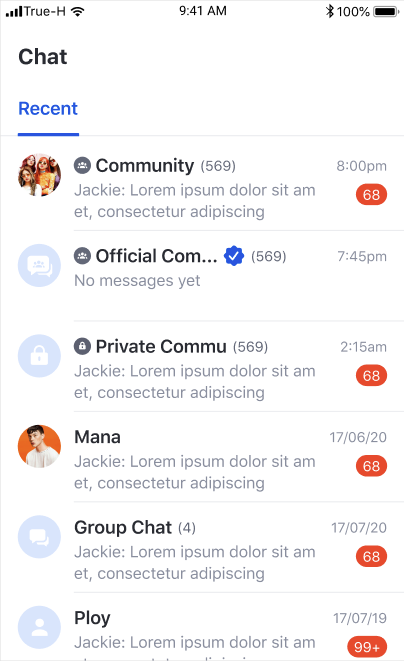
Recent chat list
User can see a list of the most recent chats
Navigation to Message list
When a user clicks a chat, UIKit opens a chatroom page
When a user clicks on the user profile avatar at the post creator area, UIKit will open
Android 5.0 (API level 21 or higher)
Java 8
androidX
Material components
Gradle 3.4.0 or higher
The UIKit API provides several strategies to integrate with your application.
Use the UIKit, ready to use out of the box
Integrate the Chat experience in the least amount of effort.
Add a custom theme to the default implementation of the UIKit.
Complete control of the visual style of Chat UI by implementing declarative styles (fonts and colours) for your user interface.
Use key components from the UIKit SDK and integrate them directly into your application.
Add the Chat UI to your existing design.
The UIKit is built on the foundation of the Amity Social Cloud API. We add a UI layer to speed product development efforts of your application. At the core, it is leveraging the same Channel, Messaging concepts, subscribing to live objects whilst adding a UIKit to accelerate product delivery and UI that delivers great user experience for companies wanting to deploy messaging and other functionality.
In the current state, there are two modules that can be used. You can follow the steps below. These two modules can be integrated into your application with ease using this documentation
Module
Description
Community (Group) Module
A feature for Social media , user can create community, create post content and see new content generate via Feed
Chat Module
A feature to allow user to create a group of chat , sending a variety of message type, such as text, image, etc.
Amity modules are ready-to-use — the only things left to do for our customers are integration and frontend. Going the extra mile, we've created a UI Kit with endless customisations.
Feature
Description
User avatar
If the user has no avatar, the system will show the default avatar.
User Display name
If the user has no display name, the display name will be 'anonymous'.
Back button
Redirect user back to the previous page.
Feature
Description
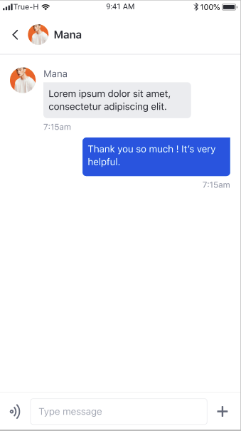
Show list of message
The latest message bubble will be on the bottom of the screen, and the user can scroll up to see all messages.
Date label
Grouping messages by the sent date.
Feature
Description
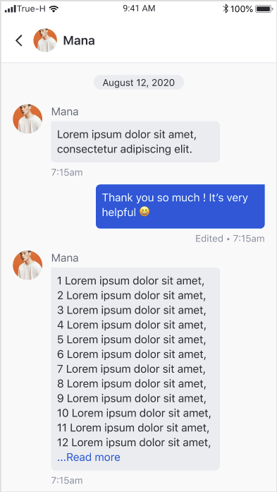
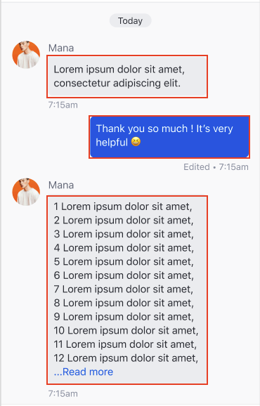
Read more mode
When the text is more than 13 lines, the system show read more mode. Once it is clicked on the read more button, it expands text to the full size.
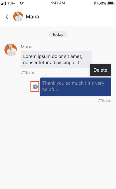
Long press to delete
If the long click event occurs, the system will show the delete option.
Long press to edit
If the long click event occurs, the system will show the edit option. When click the edit option, the system will redirect the user to the edit message page.
Error to send message indicator
If the message can not be sent, the system will show the error indicator in front of the message bubble.
Sent time stamp
Show as time stamp HH:MM
Edited label
If the message is edited, the edited label will be shown.
Deleted message
If the message is deleted, the deleted view will be shown.
Feature
Description
Image thumbnails
The system shows the image base on the image ratio. Once it is clicked, it will redirect the user to the edit message page.
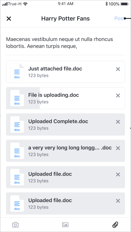
Image upload state
The system will show the image uploading indicator while the image is being uploaded.
Feature
Description
Pinch zoom gesture
The user can pinch the screen to zoom in or out the image.
back
Redirect user back to the previous page.
Feature
Description
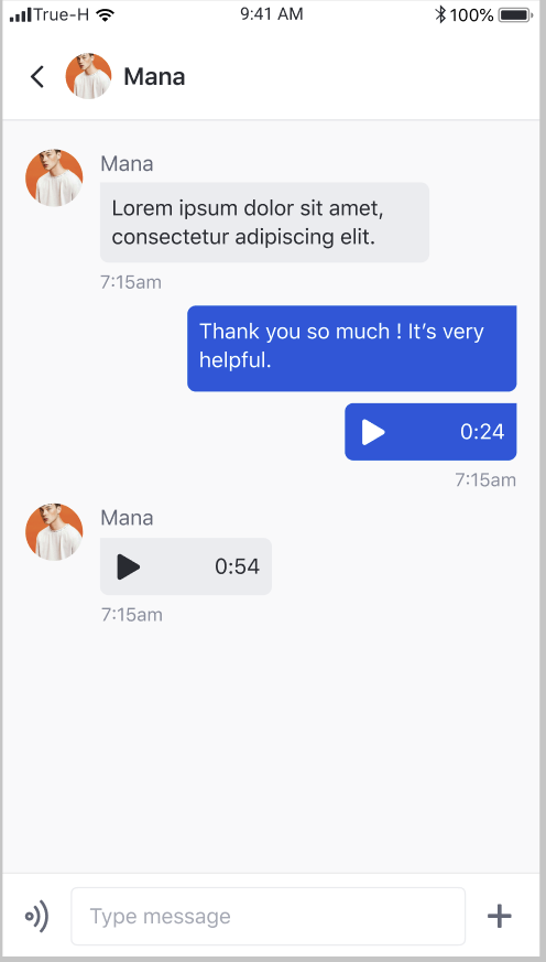
Click to play
If the user clicks on the voice message , the system will play the audio
Click to stop
If the user clicks on the playing voice message or play another voice message, the system will stop playing the playing audio.
Feature
Description
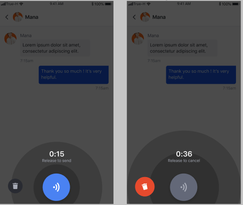
Hold to record
The user can hold to record an audio message for up to 60 seconds. Once the user releases the finger, the system will send the audio message.
Discard the record
The user can drag the finger to the bin button to discard the current recording session.
Feature
Description
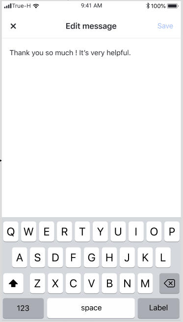
Add text
User can update the text from the original input
Save
User can click save button to save the change he made.
Discard change
user can click x to discard all change before user click save.
Parameter
Description
channelId
Use to query channel info and message list
There are many components that you can use and integrate into your existing application.
Update default avatar background color
Enhance a create community button state while waiting for creating
Fix issue where create community fail and keep showing a loader
Fix file uploading always fail at the first time logging in
Fix buttons state do not change correctly when there is any changes
Fix post creators cannot edit their own community
Fix moderator users who left from the community are able to add or remove other users
Fix whitespace characters can be sent when composing message
Prevent retain cycle where conforming EkoMessageListDataSource
Update EkoChatSDK 4.8.4
Fix authorized users are not able to edit community
Add custom settings API, and compose bar style for AmityMessageListViewController
Update EkoChatSDK 4.8.2
Update new UI for community settings
Make an about field on community profile as not required and required fields don't show asterisk mark
Hide selection box from on currentUser of selection member page
Fix the comment sorting for the newsfeed
Fix cannot undo report on the newsfeed
Fix cannot reach to bottom on community/user profile page
Update EkoChatSDK 4.8.0
Fix community detail cannot be saved
Fix invalid provided data on post detail
Fix compose bar and comment components layouts on post detail
Fix user interaction issues on post detail
Add targetId to EkoPostModel ; An id which the post belongs to
Fix bugs when users created or deleted a post causing app crashes
Fix community name wasn't updated after editing
Fix uploading stage on post when uploading failed
Explore page improvments and bug fixes
Update EkoChatSDK 4.7.0
Add EkoPostComposable ; A protocol for reconstructing and customizing post layouts
Add register UITableViewCell function to EkoFeedUISettings for handling post customizing
Update AmityChatSDK 4.6.0
Fix image selection doesn't work on some images
Fix image resolution for uploading
Fix user avatar ignores user action
Add UpstraUIKitManager.feedUISettings feature for set a network level setting to enable share settings.
Add EkoPostSharingSettings to set up sharing targets for a post
Add UpstraUIKitManager.feedUISettings.eventHandler feature for handle event share to external in Network Level.
Add EkoFeedEventHandlerto handle events for share options
When a user create community , he will automatically be moderator role of that community.
Moderator user can add member to community
Moderator user can remove member from community
Moderator user can assign other member to be moderators.
Add validation for user display name to be up to 100 characters
iOS - adjust the colour key to the correct key and shade.
API / Function change
User can Report Comment and un-report Comment
User can Report Post and un-report Post
User can Report User profile and un-report user Profile
remove 3 dot icon in user profile page.
API / Function change
Chat : New message type : Audio message
Community : Pull the page to refresh
UIKit uses a default theme as part of out of the box design language.
UIKit uses the default theme as part of the design language.
The UIKit looks great without any customisations, though you can also edit the colors and fronts in the themes to suit your preferences all the same.
However, if you wish to customise the theme, you can declare changes to both colours and typography.
UIKit uses a small set of declared colours to simplify the design task for developers. These colours are automatically rendered at appropriate shades to communicate states and interaction to the users.
UIKit uses a small set of declared colours to simplify the design task for developers. These colours are automatically rendered at appropriate shades to communicate states and interaction to the users.
Customise colour themes by declaring a colour code to the specific colour key.
Customise colour theme by declare colour code to the specific colour key.
Color
Description
Default
Primary
Used for buttons and primary call to actions
#1054DE
Secondary
Used in secondary UI elements
#292B32
Alert
Used when informing users of errors or information that requires an attention.
#FA4D30
Highlight
Used for hyperlink text
#1054DE
Base
Text presented on light background
#292B32
Base Inverse
Text presented on dark background
#FFFFFF
Message Bubble
Background colour of message bubble sent by the user
#1054DE
Message Bubble Inverse
Background colour of message bubble sent to the user
#EBECEF
Feature | Description |
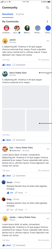
Global feed | User can scroll vertically to see a list of posts from the global feed. |
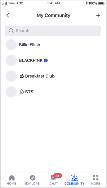
Feature
Description
My community list
User can scroll vertically to see a list of communities that the user has joined sorted in alphabetical order.
Community search
User can search for community by name
Community creation
User can click on + button, to open Community Creation page
Feature
Description
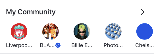
My Community list
User can scroll horizontally to see a list of up to eight communities that the user has joined sorted in alphabetical order.
Navigation to Community profile page
When a user selects an community item, the user is navigated to Community Profile page
Navigation to My community page
When a user selects the arrow, the user is navigated to My community page
Feature | Description |
User feed | User can scroll vertically to see a list of posts from a user feed |
Feature | Description |
User profile update | User can update the information such as avatar, display name, and description. Profile will be updated upon tapping save button. |
Feature | Description |
Community creation | User can create a community by filling the required fields and tapping the Create community button |
When a user clicks on the user profile avatar at the post creator area, UIKit will open User profile page
However, you can intercept the event and define your own logic following the example below.
When you create a Fragment via a Builder, you can add your own logic via onClickUserAvatar method.
There are many components that you can use and integrate into your existing application.
This settings allows you to control where a post can be shared to based on the post origin.
My feed - The post can be shared to my feed. This option will enable "Share to my timeline" menu when user clicks share button.
Public community - The post can be shared to any public community. This option will enable "Share to group" menu when user clicks share button.
Private community - The post can be shared to any private community. This option will enable "Share to group" menu when user clicks share button.
External - The post can be shared externally. This option will enable "More options" menu when user clicks share button.
Origin - The post can be shared within the community feed that it was created. If the post was created in either public or private community, this option will enable "Share to group" menu when user clicks share button.
My feed post - Posts that were created on my feed. By defaults, possible sharing targets are My feed, Public community, and Private community.
User feed post - Posts that were created on any other users' feed. By defaults, possible sharing targets are My feed, Public community, and Private community.
Public community feed post - Posts that were created on any public community. By defaults, possible sharing targets are My feed, Public community, and Private community.
Private community feed post - Posts that were created on any private community. By defaults, possible sharing target is Origin.
You can select a set of targets for each post origin.
Based on Post sharing settings, there are up to three post sharing events that can be emitted by UIKit.
Share to my timeline - an event emitted when a user clicks on "Share to my timeline" button.
Share to group - an event emitted when a user clicks on "Share to group" button.
Share externally - an event emitted when a user clicks "More options" button.
You can choose to intercept one or all of the events and apply your custom behaviour.
This page consists of one component; it is allocated in a tab.
A delegate can be passed to customise the components.
Event
Parameter
Condition
onClickUserAvatar
user: EkoUser
community avatar or community display name is tapped
onClickMessage
community: EkoCommunity
message button on community page is tapped
onClickEditProfile
community: EkoCommunity
edit profile button on community page is tapped
onClickEditUserProfile
userId: String
edit user profile button on user profile page is tapped
Method
Description
recentChatFragmentDelegate
Fragment delegation for EkoRecentChatFragment
Before using the SDK, you will need to initialise the SDK with your API key. Please find your account API key in the Amity Social Cloud Console. The ideal place to do this is on application startup, in onCreate() method of Application class.
You must first register the current device with a userId. A device registered with a userId will be permanently tied to that userId until you deliberately unregister the device, or until the device has been inactive for more than 90 days. A device registered with a specific userId will receive all messages belonging to that user.